Project Overview ✻
Mart is the smart grocery solution that makes grocery shopping easier and more affordable by allowing college students to create grocery lists, check for item availability, and compare price between grocery stores.
Problem Statement ✻
Grocery shopping tends to be an inconvenient, expensive experience. Growing up working-class, I remember my mom would hop around grocery stores to find the best deals. As a college student, I always buy the cheapest, non-branded items and fervently coupon. However, groceries is becoming less and less affordable.
Due to inflation, grocery prices have increased for 17 months in a row.
2.5% increase in diary 🥛
2.0% increase in drinks🥤
10.3% increase in eggs 🥚
Food should be affordable and easy to access, but inflation and competition between grocery stores are reinforcing inequities.
Over 3.5 months, I worked with a team of developers to design and develop a solution that would address the inaccessibility and expensiveness of grocery shopping.
What challenges did I face?
Working in an agile environment
My first experience with agile taught me a lot — aiming for an MVP each sprint was challenging, but it pushed me to grow as a designer and played a key role in delivering a functional product.
Recruiting participants for user research
It was difficult to recruit participants who aligned with our target demographic - college students who lived outside of campus and also did their own grocery shopping.
Learning about UX while actively designing and researching
Since this was a college course, I was learning and applying new concepts at the same time, which made balancing both a rewarding but challenging experience.
User Interviews ✻
We interviewed 15 Boston University college students to identify and uncover the problems that can come with grocery shopping as a college student.
Hypothesis: When it comes to grocery shopping, college students value saving money, quality food, and convenience.
Earlyvangelists:
- 4 users are willing to pay for a solution
- 7 users are actively looking for a solution
- 3 users are aware that they have a problem
- 2 users have a problem
Job to be done: Users wanted to make grocery shopping convenient and fast. They are interested in saving money but not willing to sacrifice over quality and convenience
Key takeaways:
Quality of food is an important factor
Having a grocery list is important, can help curb overspending
Each person has very different shopping preferences
Affordability and convenience are the 2 most common factors of grocery shopping
People want to know where food is located
Define ✻
User Persona
We created personas, opportunity space, and jobs to be done in order to understand more about the user’s problems.
College Carl

Age
21
Education
Undergrad
Status
Single
Occupation
Student
Location
Boston, MA

Groceries have become so expensive!

Brief story
College Carl is a Boston University college student who lives off campus. He shares an apartment with two other students. He often makes home cooked meals at home and shops at the grocery stores within walking distance from him.
Characteristics
- Has a busy schedule and a tight wallet
- Shops at grocery stores including Trader Joes and Star Market around campus
- Manages their money with whoever is most convenient
- Uses grocery store apps
- Makes grocery lists
Frustrations
- Worries about affording the cost of groceries and getting ripped off
- Balances food shopping while having a busy schedule
- Has trouble sometimes finding items at the store
User Validation
We launched a survey to understand the problem space more, asking users about their experiences grocery shopping. Our hypothesis is that student’s primary when grocery shopping are price and convenience.
Survey Insights
Students define convenience as:
- Finding everything they want in one store
- Going to a close store
88% of students surveyed do create and use a grocery list
80% of students surveyed say they would use an app that helps them save money on groceries


88%
Use a grocery list
12%
Don’t use one
Jobs to Be Done Map
We also explored the whole user journey of buying groceries from planning the grocery trip to post-grocery trip reflections to understand where the user may experience potential blockages and opportunities for growth. A majority of the pain points we uncovered were focused on the initial stages of planning for a grocery trip and searching for products while grocery shopping.

1
Plan grocery trip
Pain ✶
- Thinking about which store to go to
- The possibility of traveling long distance
- Thinking about what groceries to buy
2
Arrive at grocery store
Pain ✶
- Some stores may not offer an app to get deals
Gain ✦
- Convenient access to coupon book and deals
3
Search for products
Pain ✶
- Getting lost
- Not being able to find product
- Product being sold out
Gain ✦
- Product is on sale
4
Checkout
Pain ✶
- Some stores may not offer an app to get deals
Gain ✦
- Convenient access to deals
5
Evaluate savings
Pain ✶
- Some stores may not offer an app to get deals
Design ✻

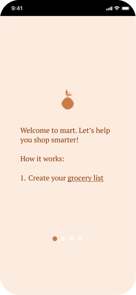
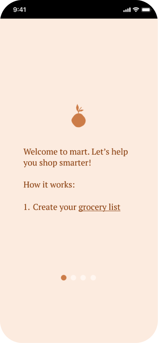
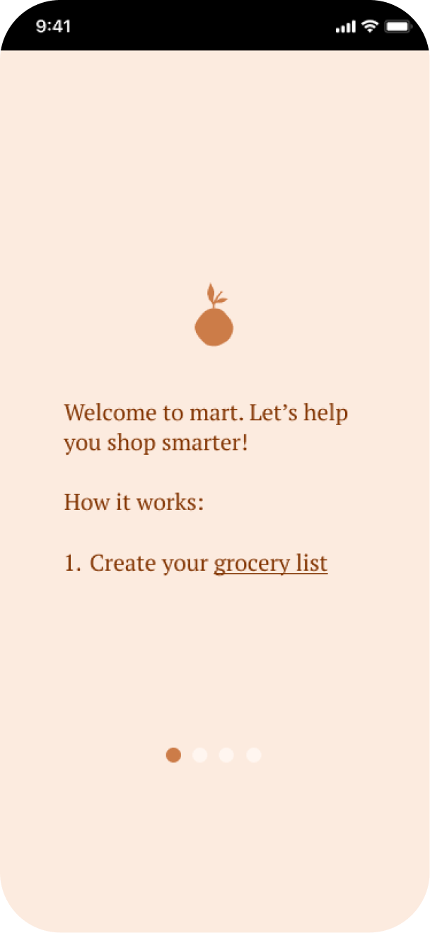
Onboarding
In the onboarding screens, first-time users can swipe to understand how to use mart. The design is simple and minimalistic to allow users to focus on the most important information.

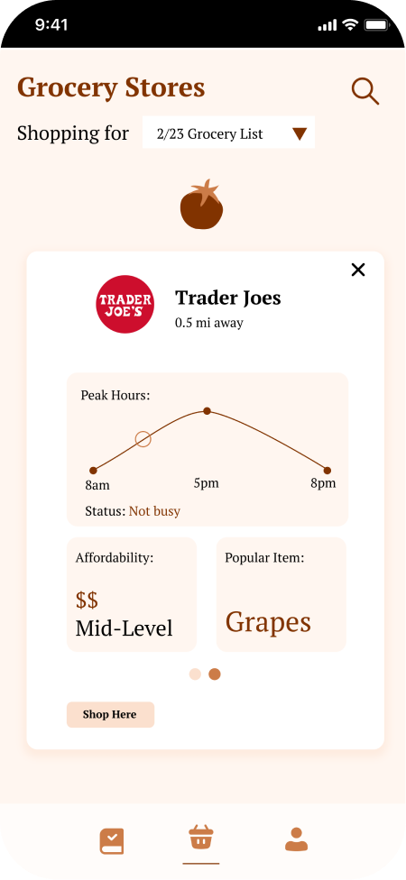
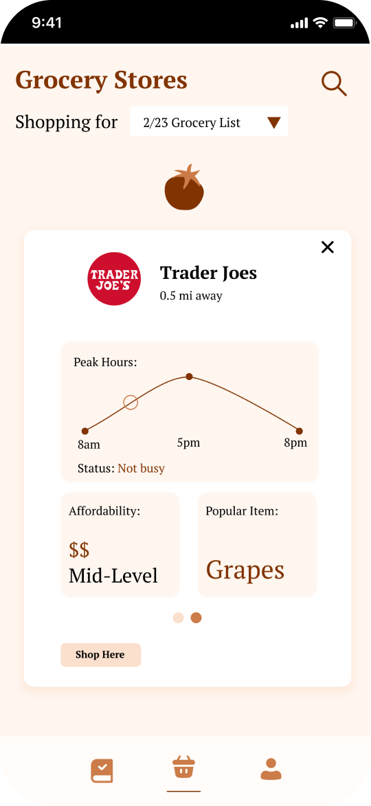
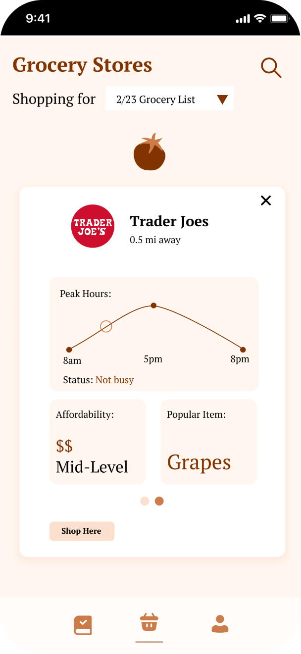
Grocery stores overview
Here, users will be able to search for grocery stores in their area and sort through them according to the items on their grocery lists. Information about the grocery store, such as the peak hours, affordability, and popular items will be displayed.

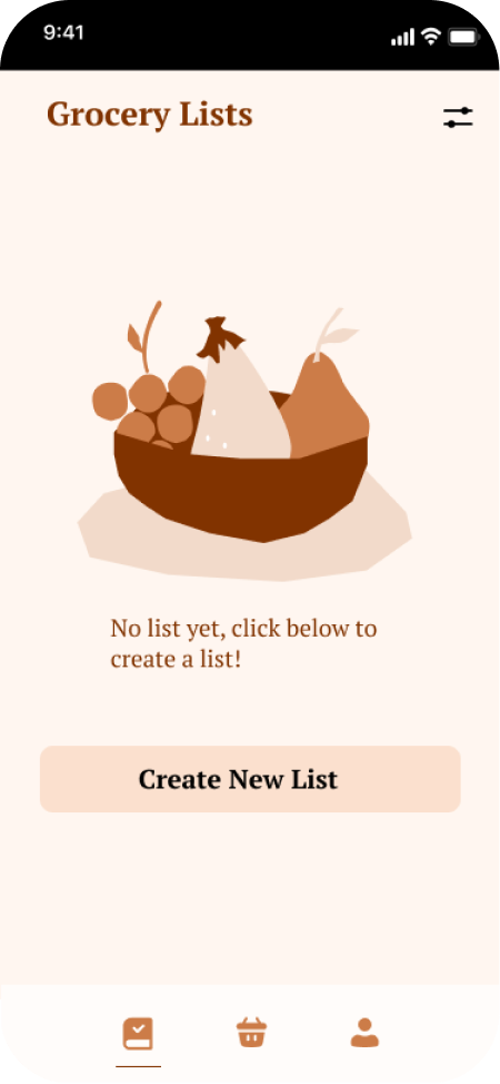
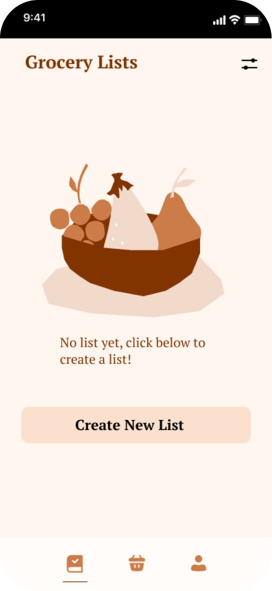
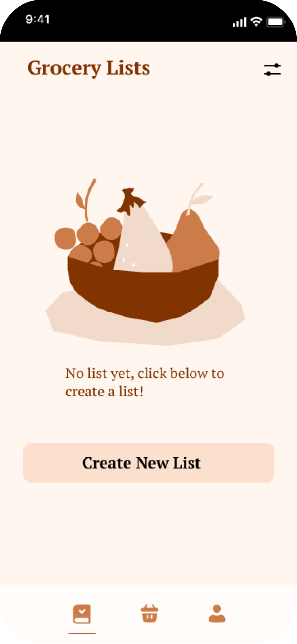
Grocery list homepage
Users will be able to see the lists that they have made and the # items within the list. Users can create a new list from this page. For first time users, they will be instructed to create a new list.


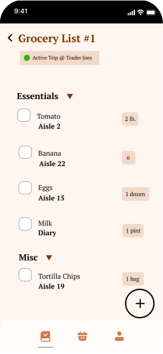
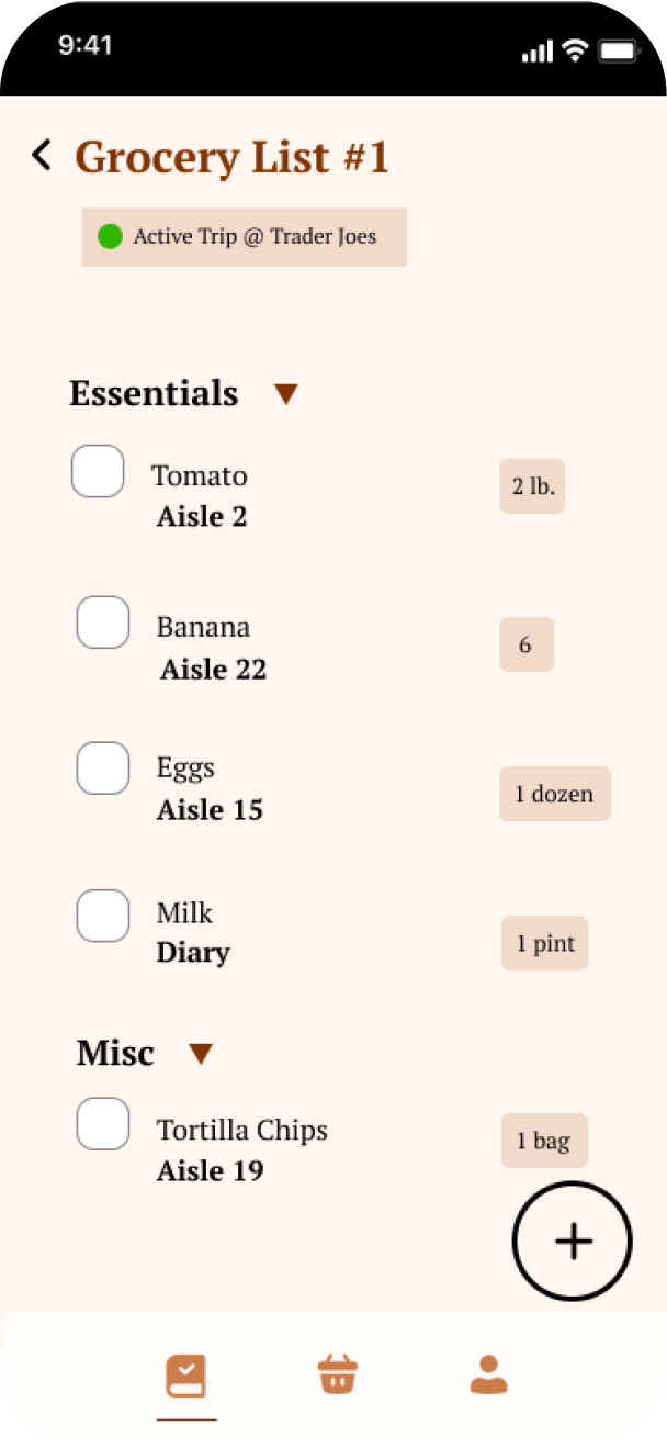
Grocery List
Users can save their list or begin trip which will then set an active trip that will help users find their grocery items.
The "begin trip" button will be greyed until the user selects a store from the store profiles page. An indicator will pop on the top once the user begins an active trip.
When users check off an item, the item will automatically move to the bottom of the list and be greyed out.
User testing ✻
I conducted usability testing with 5 users within our target audience in order to test and evaluate the effectiveness and efficiency of our solution's features in accomplishing user goals.
Two user stories to validate
I tested to see whether users were able to successfully and effectively conduct these tasks with our solution.
Make a grocery list
Look for a grocery store
What we found ✦
Users had trouble understanding the purpose of the grocery list home page
Users had trouble following the onboarding flow
Users thought finding a store was straightforward
Users weren't sure how to choose a store after creating a grocery list
Users were unclear what "begin trip" button would do
Opportunities ✶
Reassess navigation bar - make grocery list homepage instead to help guide users
Expand on UI to make purpose of each screen clear
Include ability to filter out information by affordability, convenience, etc. in the store profiles page
Final Design ✻

Takeaways ✻
This was my first time teaming up with a group of technical members to define, design, and develop a working solution to a real-world problem. It was also my first time as a product owner and working under the agile and lean methodologies to create scalable mvps every week.
This project allowed me to experience the various stages (brainstorming, defining, researching, wire-framing, and prototyping, usability testing) that come with creating a great user experience. I had a blast talking with users, understanding their pain points, and testing our prototype with them. mart has a lot of improvements that still need to be made but it addresses an imminent need that affects thousands of people.
You made it to the end! Check out these other case studies:
Mart ✷
The Intelligent Grocery Solution

In this project, I worked with a team of developers to design a smart grocery shopping app that more convenient, affordable for college students.
Date: January 13 2022- May 18 2022
Role: Product Designer
Project Type: Consumer, App
Tools & Method: Jira, Figma, Google Suites, Dribbble
Project Overview ✻
Mart is the smart grocery solution that makes grocery shopping easier and more affordable by allowing college students to create grocery lists, check for item availability, and compare price between grocery stores.
Problem Statement ✻
Grocery shopping tends to be an inconvenient, expensive experience. Growing up working-class, I remember my mom would hop around grocery stores to find the best deals. As a college student, I always buy the cheapest, non-branded items and fervently coupon. However, groceries is becoming less and less affordable.
Due to inflation, grocery prices have increased for 17 months in a row.
2.5% increase in diary 🥛
2.0% increase in drinks🥤
10.3% increase in eggs 🥚
Food should be affordable and easy to access, but inflation and competition between grocery stores are reinforcing inequities.
Over 3.5 months, I worked with a team of developers to design and develop a solution that would address the inaccessibility and expensiveness of grocery shopping.
What challenges did I face?
Working in an agile environment
My first experience with agile taught me a lot — aiming for an MVP each sprint was challenging, but it pushed me to grow as a designer and played a key role in delivering a functional product.
Recruiting participants for user research
It was difficult to recruit participants who aligned with our target demographic - college students who lived outside of campus and also did their own grocery shopping.
Learning about UX while actively designing and researching
Since this was a college course, I was learning and applying new concepts at the same time, which made balancing both a rewarding but challenging experience.
User Interviews ✻
We interviewed 15 Boston University college students to identify and uncover the problems that can come with grocery shopping as a college student.
Hypothesis: When it comes to grocery shopping, college students value saving money, quality food, and convenience.
Earlyvangelists:
- 4 users are willing to pay for a solution
- 7 users are actively looking for a solution
- 3 users are aware that they have a problem
- 2 users have a problem
Job to be done: Users wanted to make grocery shopping convenient and fast. They are interested in saving money but not willing to sacrifice over quality and convenience
Key takeaways:
Quality of food is an important factor
Having a grocery list is important, can help curb overspending
Each person has very different shopping preferences
Affordability and convenience are the 2 most common factors of grocery shopping
People want to know where food is located
Define ✻
User Persona
We created personas, opportunity space, and jobs to be done in order to understand more about the user’s problems.
College Carl

Age
21
Education
Undergrad
Status
Single
Occupation
Student
Location
Boston, MA
Groceries have become so expensive!
Brief story
College Carl is a Boston University college student who lives off campus. He shares an apartment with two other students. He often makes home cooked meals at home and shops at the grocery stores within walking distance from him.
Characteristics
- Has a busy schedule and a tight wallet
- Shops at grocery stores including Trader Joes and Star Market around campus
- Manages their money with whoever is most convenient
- Uses grocery store apps
- Makes grocery lists
Frustrations
- Worries about affording the cost of groceries and getting ripped off
- Balances food shopping while having a busy schedule
- Has trouble sometimes finding items at the store
User Validation
We launched a survey to understand the problem space more, asking users about their experiences grocery shopping. Our hypothesis is that student’s primary when grocery shopping are price and convenience.
Survey Insights
Students define convenience as:
- Finding everything they want in one store
- Going to a close store
88% of students surveyed do create and use a grocery list
80% of students surveyed say they would use an app that helps them save money on groceries
Survey Insights
Students define convenience as:
- Finding everything they want in one store
- Going to a close store
88% of students surveyed do create and use a grocery list
80% of students surveyed say they would use an app that helps them save money on groceries


88%
Use a grocery list


12%
Don’t use one
Jobs to Be Done Map
We also explored the whole user journey of buying groceries from planning the grocery trip to post-grocery trip reflections to understand where the user may experience potential blockages and opportunities for growth. A majority of the pain points we uncovered were focused on the initial stages of planning for a grocery trip and searching for products while grocery shopping.
1
Plan grocery trip
Pain ✶
- Thinking about which store to go to
- The possibility of traveling long distance
- Thinking about what groceries to buy
2
Arrive at grocery store
Pain ✶
- Some stores may not offer an app to get deals
Gain ✦
- Convenient access to coupon book and deals
3
Search for products
Pain ✶
- Some stores may not offer an app to get deals
Gain ✦
- Convenient access to coupon book and deals
4
Checkout

Pain ✶
- Some stores may not offer an app to get deals
Gain ✦
- Convenient access to coupon book and deals
4
Evaluate savings
Pain ✶
- Some stores may not offer an app to get deals
Gain ✦
- Convenient access to coupon book and deals
Design ✻

Onboarding
In the onboarding screens, first-time users can swipe to understand how to use mart. The design is simple and minimalistic to allow users to focus on the most important information.

Grocery stores overview
Here, users will be able to search for grocery stores in their area and sort through them according to the items on their grocery lists. Information about the grocery store, such as the peak hours, affordability, and popular items will be displayed.

Grocery list homepage
Users will be able to see the lists that they have made and the # items within the list. Users can create a new list from this page. For first time users, they will be instructed to create a new list.

Grocery List
Users can save their list or begin trip which will then set an active trip that will help users find their grocery items.
The "begin trip" button will be greyed until the user selects a store from the store profiles page. An indicator will pop on the top once the user begins an active trip.
When users check off an item, the item will automatically move to the bottom of the list and be greyed out.
User testing ✻
I conducted usability testing with 5 users within our target audience in order to test and evaluate the effectiveness and efficiency of our solution's features in accomplishing user goals.
Two user stories to validate
I tested to see whether users were able to successfully and effectively conduct these tasks with our solution.
Make a grocery list
Look for a grocery store
What we found ✦
Users had trouble understanding the purpose of the grocery list home page
Users weren't sure how to choose a store after creating a grocery list
Users had trouble following the onboarding flow
Users were unclear what "begin trip" button would do
Users thought finding a store was straightforward
Opportunities ✶
Reassess navigation bar - make grocery list homepage instead to help guide users
Expand on UI to make purpose of each screen clear
Include ability to filter out information by affordability, convenience, etc. in the store profiles page
Final Design ✻
Takeaways ✻
This was my first time teaming up with a group of technical members to define, design, and develop a working solution to a real-world problem. It was also my first time as a product owner and working under the agile and lean methodologies to create scalable mvps every week.
This project allowed me to experience the various stages (brainstorming, defining, researching, wire-framing, and prototyping, usability testing) that come with creating a great user experience. I had a blast talking with users, understanding their pain points, and testing our prototype with them. mart has a lot of improvements that still need to be made but it addresses an imminent need that affects thousands of people.
You made it to the end! Check out these other case studies
Mart ✷
The Intelligent Grocery Solution
In this project, I worked with a team of developers to design a smart grocery shopping app that more convenient, affordable for college students.
Date: January 13 2022- May 18 2022
Role: Product Designer
Project Type: Consumer, App
Tools & Method: Jira, Figma, Google Suites, Dribbble
Project Overview ✻
Mart is the smart grocery solution that makes grocery shopping easier and more affordable by allowing college students to create grocery lists, check for item availability, and compare price between grocery stores.
Problem Statement ✻
Grocery shopping tends to be an inconvenient, expensive experience. Growing up working-class, I remember my mom would hop around grocery stores to find the best deals. As a college student, I always buy the cheapest, non-branded items and fervently coupon. However, groceries is becoming less and less affordable.
Due to inflation, grocery prices have increased for 17 months in a row.
2.5% increase in diary 🥛
2.0% increase in drinks🥤
10.3% increase in eggs 🥚
Food should be affordable and easy to access, but inflation and competition between grocery stores are reinforcing inequities.
Over 3.5 months, I worked with a team of developers to design and develop a solution that would address the inaccessibility and expensiveness of grocery shopping.
What challenges did I face?
Working in an agile environment
My first experience with agile taught me a lot — aiming for an MVP each sprint was challenging, but it pushed me to grow as a designer and played a key role in delivering a functional product.
Learning about UX while actively designing and researching
Since this was a college course, I was learning and applying new concepts at the same time, which made balancing both a rewarding but challenging experience.
Recruiting participants for user research
It was difficult to recruit participants who aligned with our target demographic - college students who lived outside of campus and also did their own grocery shopping.
User Interviews ✻
We interviewed 15 Boston University college students to identify and uncover the problems that can come with grocery shopping as a college student.
Hypothesis: When it comes to grocery shopping, college students value saving money, quality food, and convenience.
Earlyvangelists:
- 4 users are willing to pay for a solution
- 7 users are actively looking for a solution
- 3 users are aware that they have a problem
- 2 users have a problem
Job to be done: Users wanted to make grocery shopping convenient and fast. They are interested in saving money but not willing to sacrifice over quality and convenience
Key takeaways:
Quality of food is an important factor
Having a grocery list is important, can help curb overspending
Each person has very different shopping preferences
Affordability and convenience are the 2 most common factors of grocery shopping
People want to know where food is located
Define ✻
User Persona
We created personas, opportunity space, and jobs to be done in order to understand more about the user’s problems.
College Carl
Age
21
Education
Undergrad
Status
Single
Occupation
Student
Location
Boston, MA
Groceries have become so expensive!
Brief story
College Carl is a Boston University college student who lives off campus. He shares an apartment with two other students. He often makes home cooked meals at home and shops at the grocery stores within walking distance from him.
Characteristics
- Has a busy schedule and a tight wallet
- Shops at grocery stores including Trader Joes and Star Market around campus
- Manages their money with whoever is most convenient
- Uses grocery store apps
- Makes grocery lists
Frustrations
- Worries about affording the cost of groceries and getting ripped off
- Balances food shopping while having a busy schedule
- Has trouble sometimes finding items at the store
User Validation
We launched a survey to understand the problem space more, asking users about their experiences grocery shopping. Our hypothesis is that student’s primary when grocery shopping are price and convenience.
Survey Insights
Students define convenience as:
- Finding everything they want in one store
- Going to a close store
88% of students surveyed do create and use a grocery list
80% of students surveyed say they would use an app that helps them save money on groceries

88%
Use a grocery list
12%
Don’t use one
Jobs to Be Done Map
We also explored the whole user journey of buying groceries from planning the grocery trip to post-grocery trip reflections to understand where the user may experience potential blockages and opportunities for growth. A majority of the pain points we uncovered were focused on the initial stages of planning for a grocery trip and searching for products while grocery shopping.
1
Plan grocery trip

Pain ✶
- Thinking about which store to go to
- The possibility of traveling long distance
- Thinking about what groceries to buy
2
Arrive at grocery store

Pain ✶
- Some stores may not offer an app to get deals
Gain ✦
- Convenient access to coupon book and deals
3
Search for products

Pain ✶
- Getting lost
- Not being able to find product
- Product being sold out
Gain ✦
- Product is on sale
4
Checkout

Pain ✶
- Some stores may not offer an app to get deals
Gain ✦
- Convenient access to deals
5
Evaluate savings

Pain ✶
- Some stores may not offer an app to get deals
Design ✻

Onboarding
In the onboarding screens, first-time users can swipe to understand how to use mart. The design is simple and minimalistic to allow users to focus on the most important information.
Grocery stores overview
Here, users will be able to search for grocery stores in their area and sort through them according to the items on their grocery lists. Information about the grocery store, such as the peak hours, affordability, and popular items will be displayed.


Grocery list homepage
Users will be able to see the lists that they have made and the # items within the list. Users can create a new list from this page. For first time users, they will be instructed to create a new list.
Grocery List
Users can save their list or begin trip which will then set an active trip that will help users find their grocery items.
The "begin trip" button will be greyed until the user selects a store from the store profiles page. An indicator will pop on the top once the user begins an active trip.
When users check off an item, the item will automatically move to the bottom of the list and be greyed out.

User testing ✻
I conducted usability testing with 5 users within our target audience in order to test and evaluate the effectiveness and efficiency of our solution's features in accomplishing user goals.
Two user stories to validate
I tested to see whether users were able to successfully and effectively conduct these tasks with our solution.
Make a grocery list
Look for a grocery store
What we found ✦
Users had trouble understanding the purpose of the grocery list home page
Users weren't sure how to choose a store after creating a grocery list
Users had trouble following the onboarding flow
Users were unclear what "begin trip" button would do
Users thought finding a store was straightforward
Opportunities ✶
Reassess navigation bar - make grocery list homepage instead to help guide users
Expand on UI to make purpose of each screen clear
Include ability to filter out information by affordability, convenience, etc. in the store profiles page
Final Design ✻
Takeaways ✻
This was my first time teaming up with a group of technical members to define, design, and develop a working solution to a real-world problem. It was also my first time as a product owner and working under the agile and lean methodologies to create scalable mvps every week.
This project allowed me to experience the various stages (brainstorming, defining, researching, wire-framing, and prototyping, usability testing) that come with creating a great user experience. I had a blast talking with users, understanding their pain points, and testing our prototype with them. mart has a lot of improvements that still need to be made but it addresses an imminent need that affects thousands of people.
You made it to the end! Check out these other case studies