Wisely ✻
Partial Direct Deposit
In this project, I redesign Wisely’s direct deposit allocation screens, creating a new user experience that is easier to understand and more relevant to the user’s goals.
Date: March 29 2024 - Oct 10 2024
Role: Product Designer
Project Type: Fintech, App, Web
Tools & Method: Dribbble, Jira, Figma, Miro
A clearer, smarter direct deposit experience ✻
Wisely is an online banking solution offering users 100% digital pay, along with benefits like early pay and cash back rewards—all streamlined and managed through the myWisely app. This project aims to redesign Wisely's partial direct deposit experience, guiding users more effectively as they allocate their pay across various bank accounts.
As the designer of this project, my aim is to ensure users clearly understand their paycheck allocation, recognize the benefits of transferring money to their Wisely account, and feel empowered to make changes throughout the partial direct deposit process.
The Results: Turning Confusion into Conversions
For in-app activations
15k out of 24k users successfully set up their direct deposit
64% conversion rate
For new activations
437 out of 658 users successfully set up their direct deposit
67% conversion rate
For self enrollment
266 out of 527 users successfully set up their direct deposit
50% conversion rate
Identifying the problem: why people struggled with direct deposit ✻
Imagine that you switched to myWisely and you want to set up your direct deposit for the first time. You log in to the app, expecting to see a few screens asking you how much of your pay you want to direct into your bank account. However, you see a confusing toggle with a “$” sign, a “%” sign and “all”. You’re not sure what that means. One of the reasons why you choose Wisely is its early direct deposit feature, but you don’t see any information for that. You tried to complete the task as quickly as possible, but it ended up taking longer than expected.
This was Wisely’s original direct deposit flow: a confusing and lengthy experience that failed to capture user’s trust. And despite being a high-impact conversion funnel, there was a missed opportunity to position myWisely’s value to users. As the designer, I asked myself how could I turn a “meh” experience into an empowering, delightful, and agentic one?
Design challenges along the way
Working with limitations in user information
Wisely doesn’t have information on how much users get paid so the design must work around that.
Advocating for user experience
Balancing both the needs of intermediate users and beginner users by creating an experience that caters to them all.
Designing for complexity
Making sense of ambiguity and complex money movements, and ultimately creating an experience that is empowering, easy to use, and transparent.
Competitive Insights that shaped my approach ✻
Because partial direct deposit is a niche feature that exists within the financial tech domain, I focused my explorations on how competitors organized data for percentages and specific amounts.
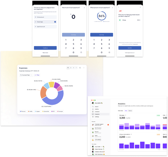
Source: Dashboard by turingLabs, dashboard by FineTune, and Atomic’s partial direct deposit flow by Chime
Designing for real people: Meet Sam ✻
Sam - the Wisely member

Age
43
Education
High School
Status
Married
Occupation
Clerk
Location
Charleston, SC

Wisely is the only card I use to pay all my bills.

Brief story
Sam is an archetype we have created at Wisely to understand and empathize with our users. They are financially insecure and often live paycheck to paycheck. They use the Wisely card for all their payments.
Characteristics
- Experience with Wisely Pay is shaped by their employer’s involvement
- Uses the same money apps as their social circle
- Manages their money with whoever is most convenient
- Aspires to save and attain financial stability
Frustrations
- Can’t bear paying unjust fees
- Can’t afford a financial setback
- Due dates and making payments
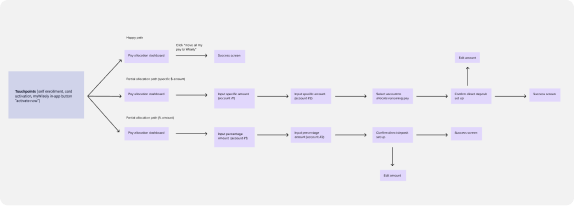
Mapping the user journey
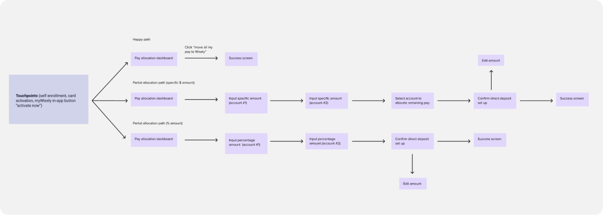
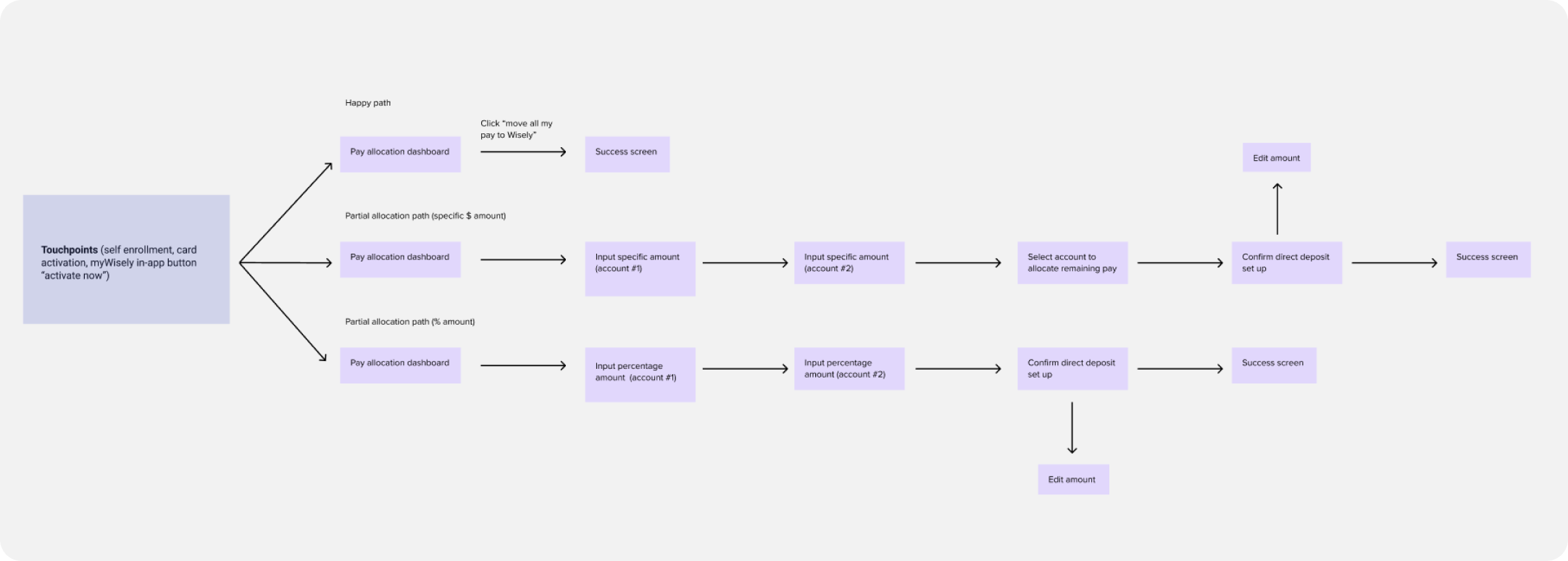
There are several touchpoints during user onboarding that will direct them to the partial direct deposit experience (e.g. pre log-in activation, in-app activation and self-enrollment).
Testing the flow: key insights from real people ✻
After completing the first round of high-fidelity designs, I partnered up with a user researcher to conduct user testing with 8 individuals who use direct deposit through their employer. We tested three types of flows:
Happy path ☺️ (full allocation of DD to Wisely)
Partial allocation through percentage amount %
Partial allocation through specific dollar amount $
Our aim of the study was to assess whether users could easily and efficiently set up partial direct deposit and and identify any confusing language or terminology.
We identified a few areas where minor adjustments could enhance the flow's usability and clarity.
Users were confused by the “edit direct deposit amount” button because it is used in the introductory screen as well as in the set up confirmation screen. Although both buttons are named the same, they each carry out different functions.
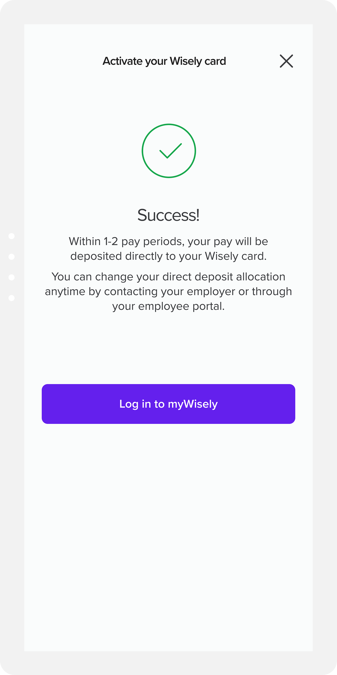
Many requested more information about the pay periods at the success screen. Users had questions about next steps and wanted more clarity on the direct deposit process.
Introducing friction in the right places: guardrails ✻
Given the complexities of the direct deposit allocation flow, I implemented several guardrails throughout the process. These safeguards aim to guide users toward making optimal decisions for their direct deposit setup while also preventing errors before they occur.
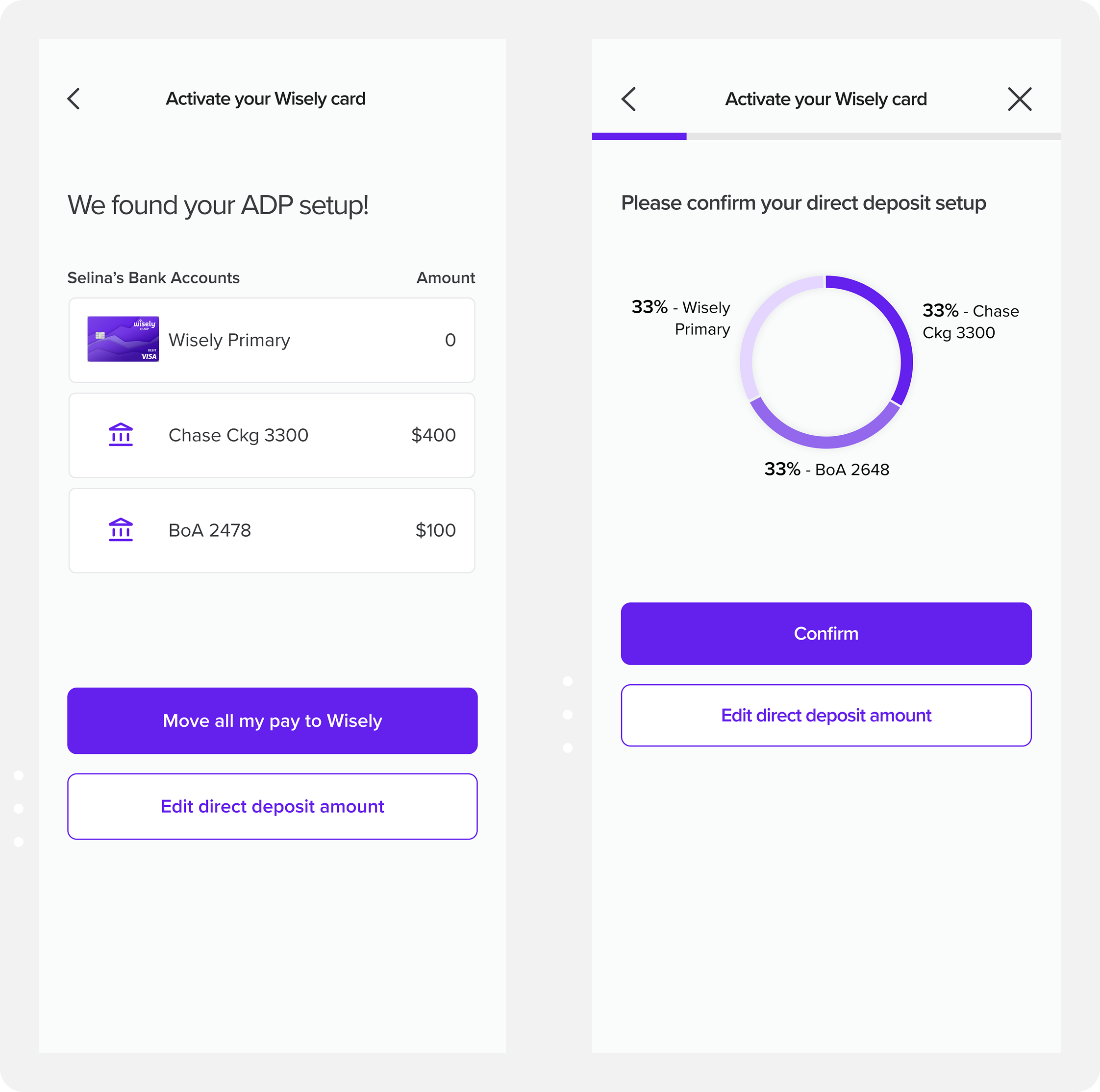
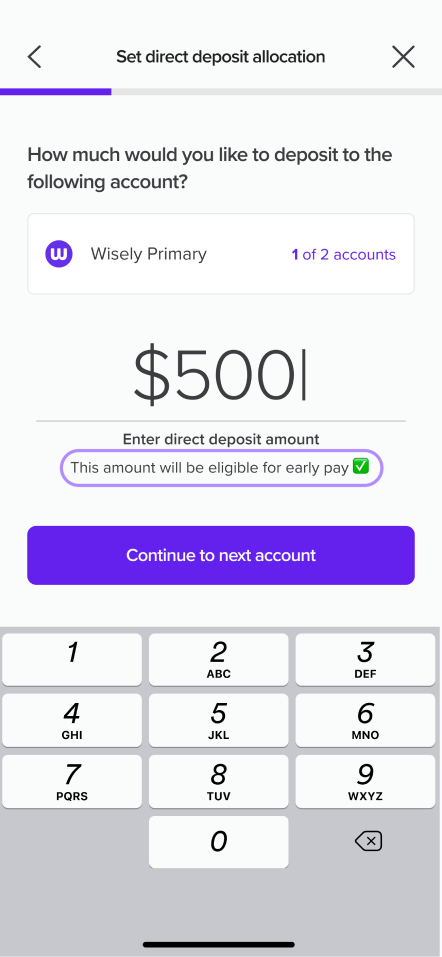
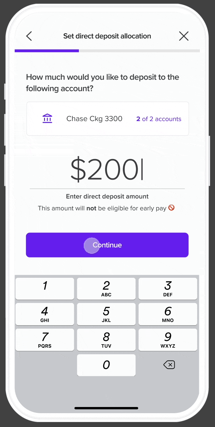
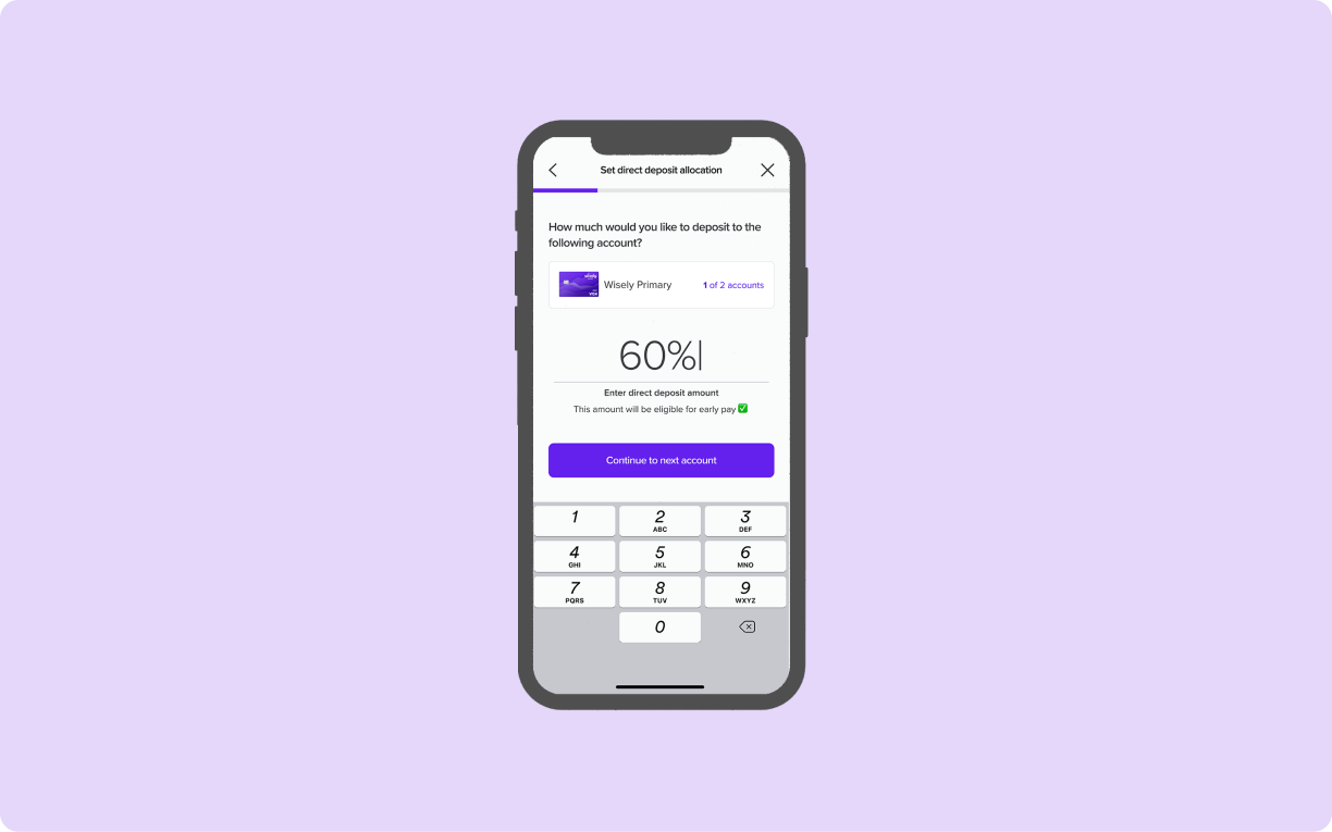
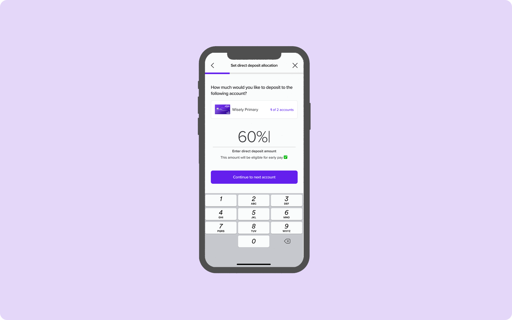
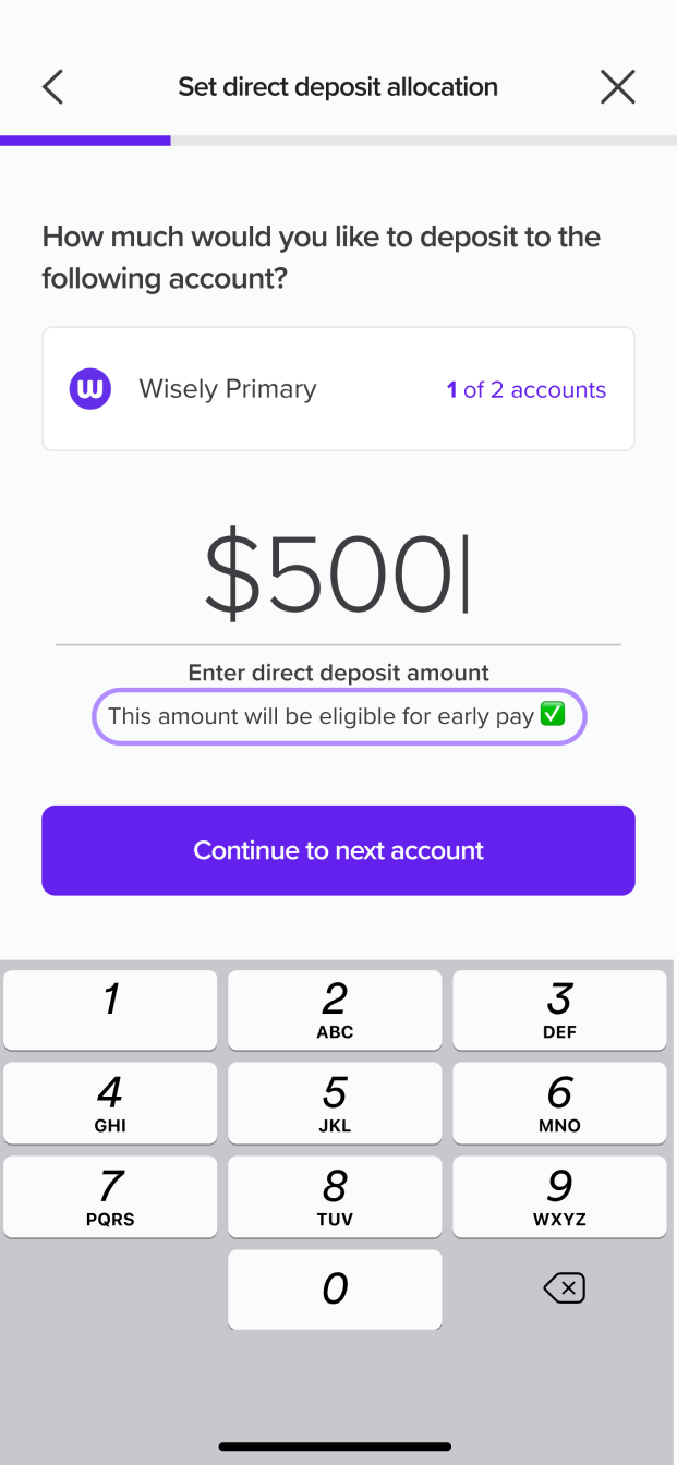
A unique selling point for depositing money to Wisely is that users can get paid up to two days early. I've included additional language beneath the input to clarify that early pay is only available for Wisely accounts.
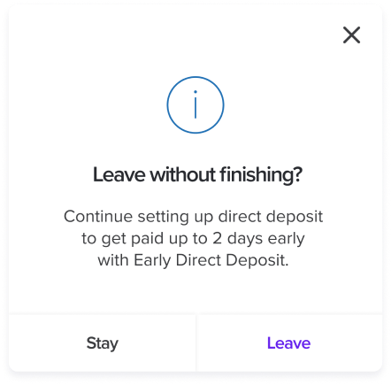
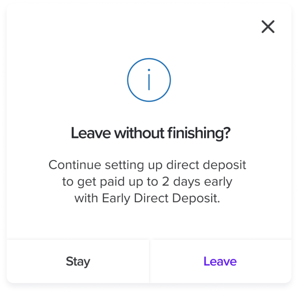
If users attempt to exit the flow, they'll encounter a modal asking them to confirm their decision to leave. This modal also highlights a benefit of continuing the process- the potential of getting paid early.
Bringing it all together: the final experience ✻
Direct Deposit Homepage
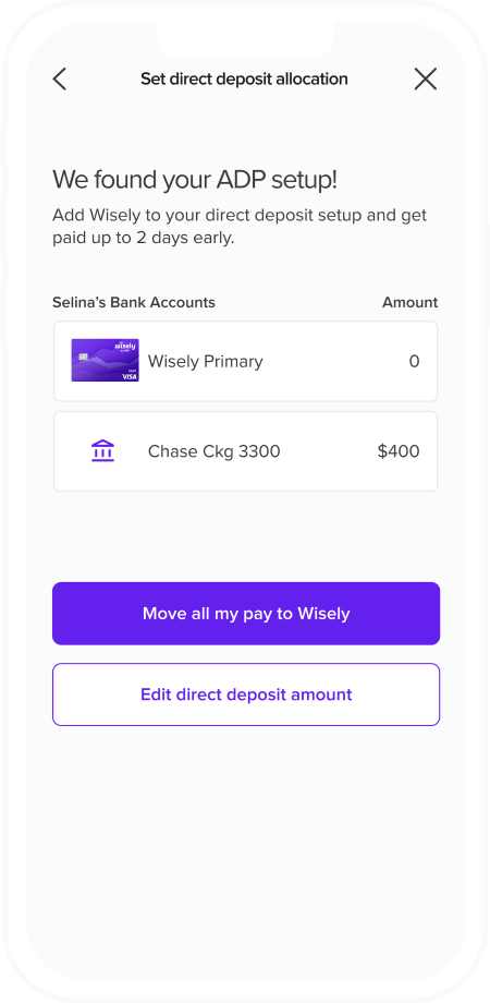
The direct deposit home page gives users an overview of the number of bank accounts they have as well as their respective amounts. The primary action is for users to move their full pay to Wisely, with a secondary button that leads users to the partial direct deposit experience where they can select their direct deposit method.
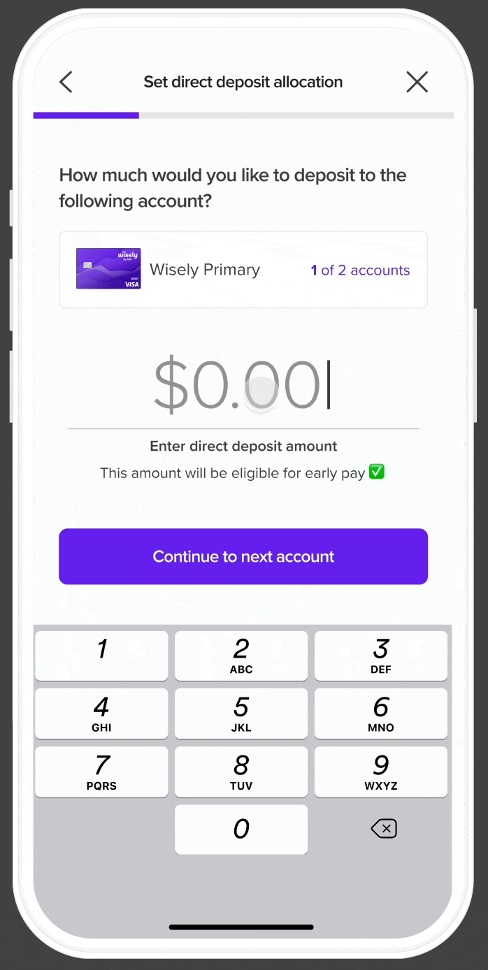
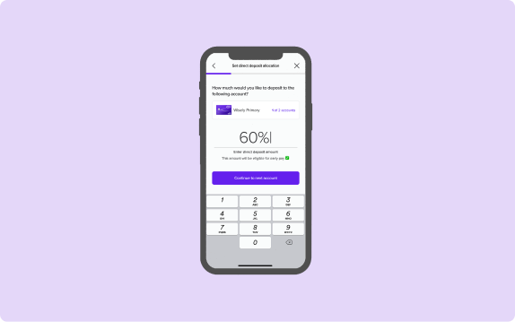
Set Direct Deposit Allocation
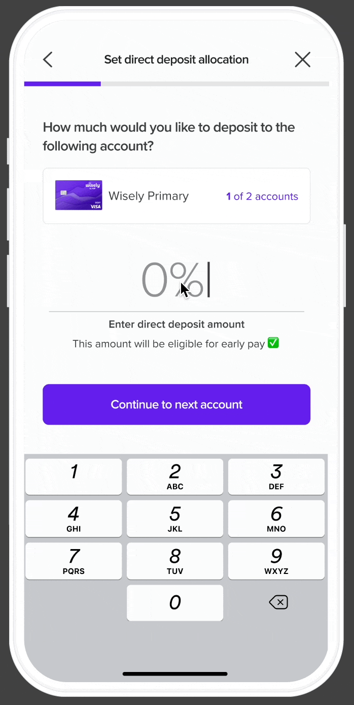
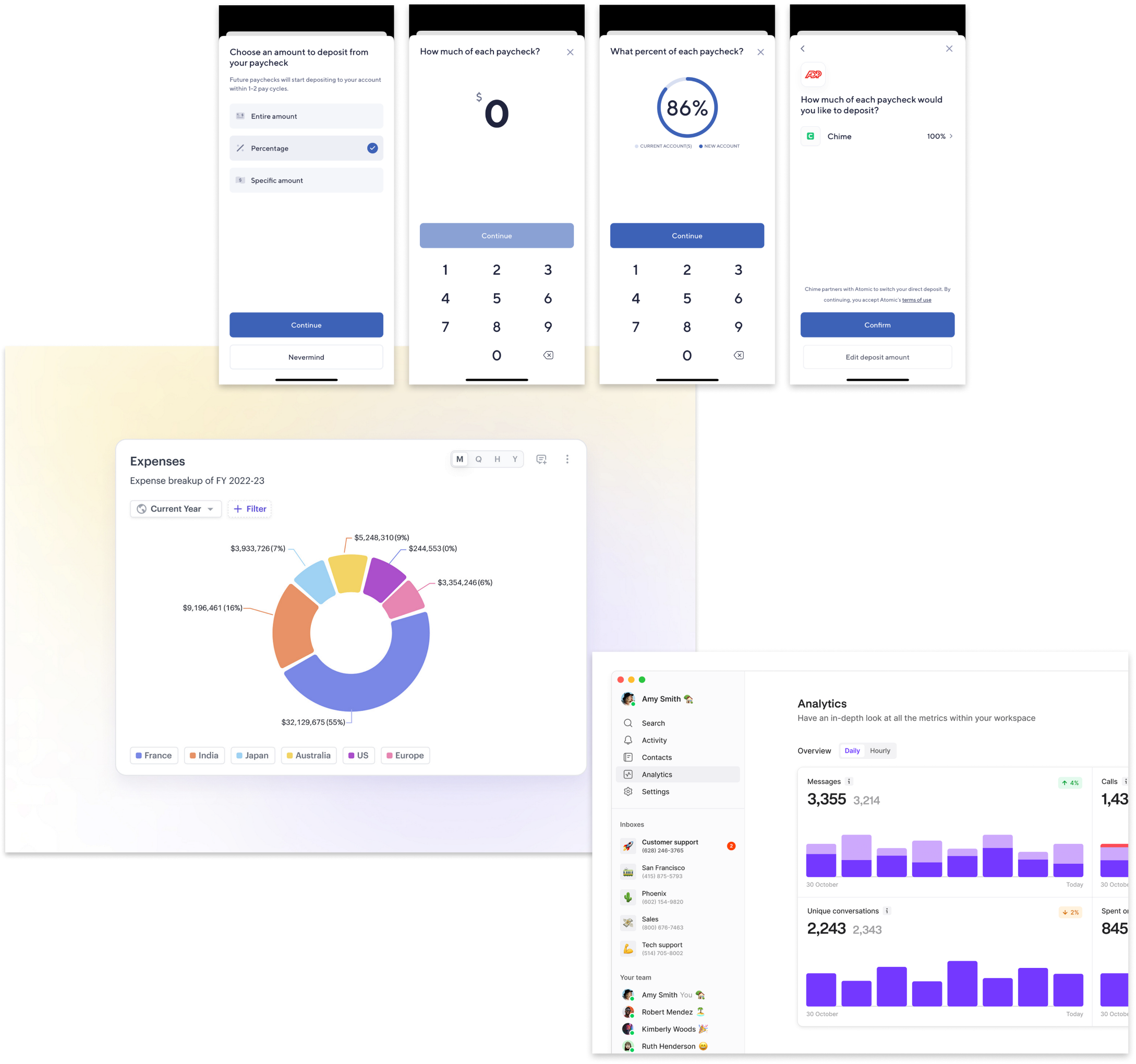
Users have the option to choose between three types of direct deposit allocation options: depositing entire amount, depositing by specific dollar amount, and depositing by percentage.
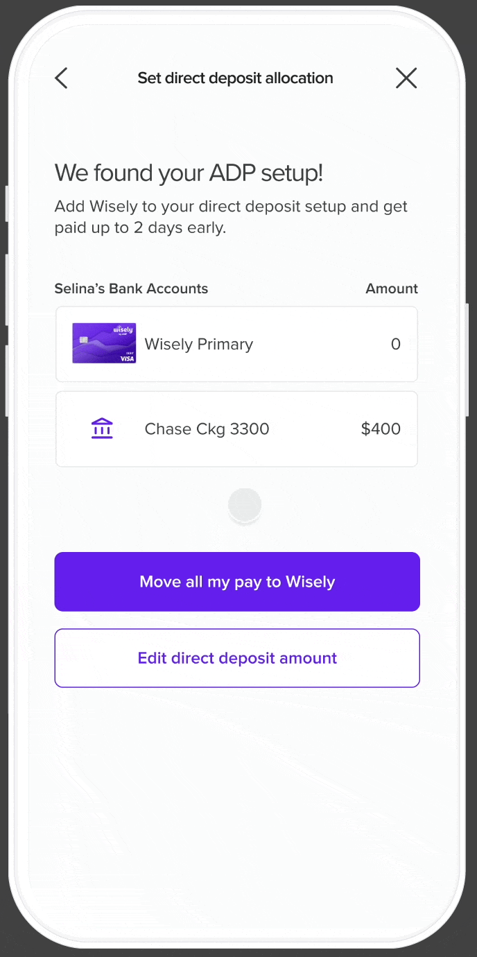
There may be scenarios where users might have inconsistent paychecks. To address this, I included an option for users to designate an account for any excess pay. This feature ensures flexibility in handling fluctuating income.
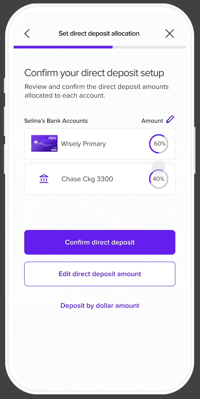
Before confirming their direct deposit, users can modify their allocation, adjust the remaining pay, or switch their allocation method from a specific amount to a percentage.
Takeaways ✻
This project presented a significant design challenge due to the intricacies of direct deposit allocation and money movement. Through the redesign, the direct deposit flow can serve every user’s needs regardless of their pay structures and financial situations. Through this project, I was able to break down the complexities of the process and reconstruct them into a user-friendly experience that caters to a wide range of users. Additionally, a design patent was recently awarded for the visualization of the pie chart percentage allocation.
You made it to the end! Check out these other case studies:
Wisely ✻
Partial Direct Deposit

In this project, I redesign Wisely’s direct deposit allocation screens, creating a new user experience that is easier to understand and more relevant to the user’s goals.
Date: March 29 2024 - Oct 10 2024
Role: Product Designer
Project Type: Fintech, App, Web
Tools & Method: Dribbble, Jira, Figma, Miro
A clearer, smarter direct deposit experience ✻
Wisely is an online banking solution offering users 100% digital pay, along with benefits like early pay and cash back rewards—all streamlined and managed through the myWisely app. This project aims to redesign Wisely's partial direct deposit experience, guiding users more effectively as they allocate their pay across various bank accounts.
As the designer of this project, my aim is to ensure users clearly understand their paycheck allocation, recognize the benefits of transferring money to their Wisely account, and feel empowered to make changes throughout the partial direct deposit process.
The Results: Turning Confusion into Conversions
For in-app activations
15k out of 24k users successfully set up their direct deposit
64% conversion rate
For new activations
437 out of 658 users successfully set up their direct deposit
67% conversion rate
For self enrollment
266 out of 527 users successfully set up their direct deposit
50% conversion rate
Identifying the problem: why people struggled with direct deposit ✻
Imagine that you switched to myWisely and you want to set up your direct deposit for the first time. You log in to the app, expecting to see a few screens asking you how much of your pay you want to direct into your bank account. However, you see a confusing toggle with a “$” sign, a “%” sign and “all”. You’re not sure what that means. One of the reasons why you choose Wisely is its early direct deposit feature, but you don’t see any information for that. You tried to complete the task as quickly as possible, but it ended up taking longer than expected.
This was Wisely’s original direct deposit flow: a confusing and lengthy experience that failed to capture user’s trust. And despite being a high-impact conversion funnel, there was a missed opportunity to position myWisely’s value to users. As the designer, I asked myself how could I turn a “meh” experience into an empowering, delightful, and agentic one?
Design challenges along the way
Working with limitations in user information
Wisely doesn’t have information on how much users get paid so the design must work around that.
Advocating for user experience
Balancing both the needs of intermediate users and beginner users by creating an experience that caters to them all.
Designing for complexity
Making sense of ambiguity and complex money movements, and ultimately creating an experience that is empowering, easy to use, and transparent.
Competitive Insights that shaped my approach ✻
Because partial direct deposit is a niche feature that exists within the financial tech domain, I focused my explorations on how competitors organized data for percentages and specific amounts.
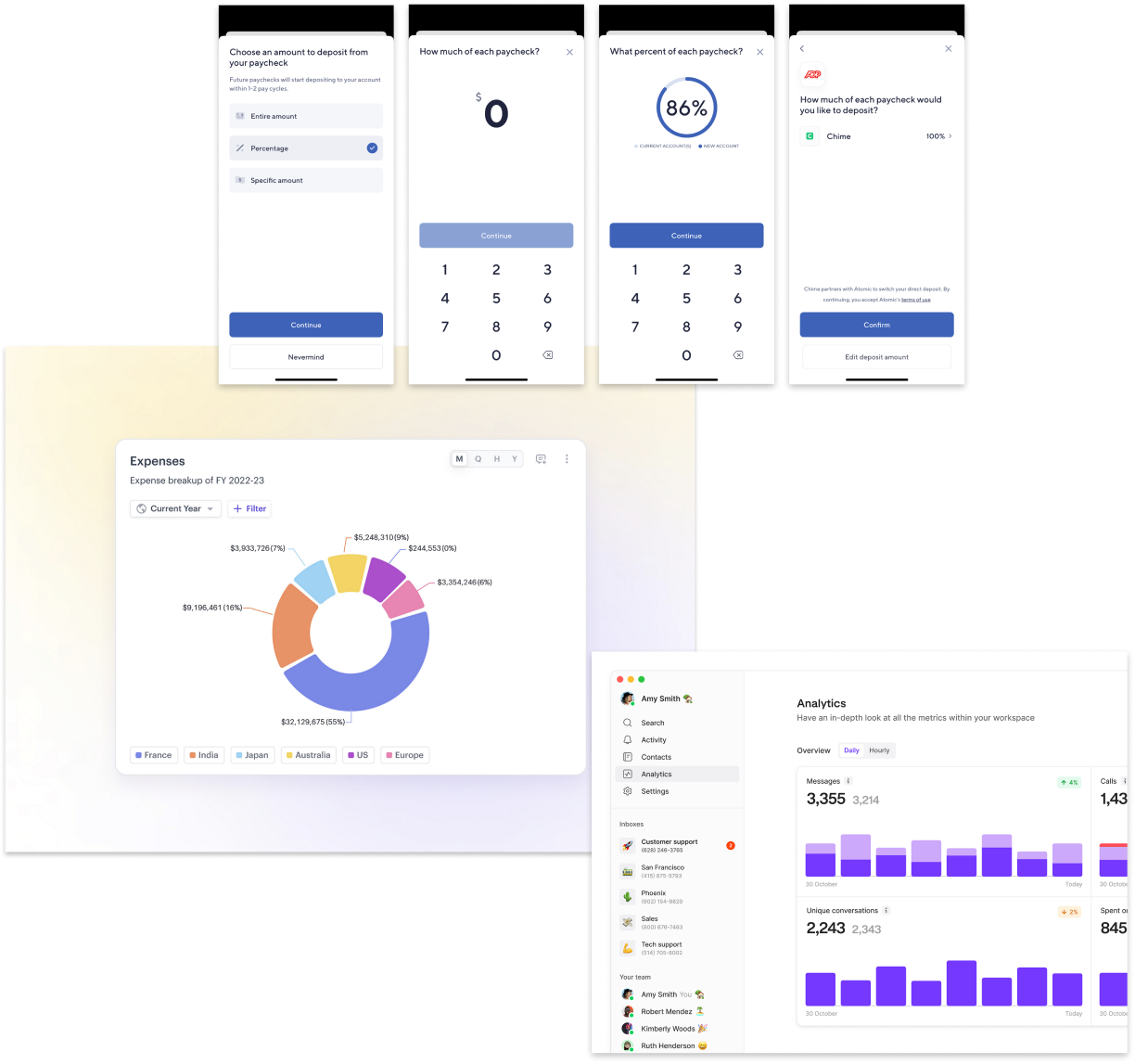
Source: Dashboard by turingLabs, dashboard by FineTune, and Atomic’s partial direct deposit flow by Chime
Designing for our users: meet Sam ✻
Sam - the Wisely member
Age
43
Education
High School
Status
Married
Occupation
Clerk
Location
Charleston, SC
Wisely is the only card I use to pay all my bills.
Brief story
Sam is an archetype we have created at Wisely to understand and empathize with our users. They are financially insecure and often live paycheck to paycheck. They use the Wisely card for all their payments.
Characteristics
- Experience with Wisely Pay is shaped by their employer’s involvement
- Uses the same money apps as their social circle
- Manages their money with whoever is most convenient
- Aspires to save and attain financial stability
Frustrations
- Can’t bear paying unjust fees
- Can’t afford a financial setback ️
- Due dates and making payments
Mapping the user journey
There are several touchpoints during user onboarding that will direct them to the partial direct deposit experience (e.g. pre log-in activation, in-app activation and self-enrollment).
Testing the flow: key insights from real people ✻
After completing the first round of high-fidelity designs, I partnered up with a user researcher to conduct user testing with 8 individuals who use direct deposit through their employer. We tested three types of flows:
Happy path ☺️ (full allocation of DD to Wisely)
Partial allocation through percentage amount %
Partial allocation through specific dollar amount $
Our aim of the study was to assess whether users could easily and efficiently set up partial direct deposit and and identify any confusing language or terminology.
We identified a few areas where minor adjustments could enhance the flow's usability and clarity.
Users were confused by the “edit direct deposit amount” button because it is used in the introductory screen as well as in the set up confirmation screen. Although both buttons are named the same, they each carry out different functions.
Many requested more information about the pay periods at the success screen. Users had questions about next steps and wanted more clarity on the direct deposit process.
Introducing friction in the right places: guardrails ✻
Given the complexities of the direct deposit allocation flow, I implemented several guardrails throughout the process. These safeguards aim to guide users toward making optimal decisions for their direct deposit setup while also preventing errors before they occur.
A unique selling point for depositing money to Wisely is that users can get paid up to two days early. I've included additional language beneath the input to clarify that early pay is only available for Wisely accounts.

If users attempt to exit the flow, they'll encounter a modal asking them to confirm their decision to leave. This modal also highlights a benefit of continuing the process- the potential of getting paid early.
Bringing it all together: the final experience ✻
Direct Deposit Homepage
The direct deposit home page gives users an overview of the number of bank accounts they have as well as their respective amounts. The primary action is for users to move their full pay to Wisely, with a secondary button that leads users to the partial direct deposit experience where they can select their direct deposit method.
Set Direct Deposit Allocation
Users have the option to choose between three types of direct deposit allocation options: depositing entire amount, depositing by specific dollar amount, and depositing by percentage.
There may be scenarios where users might have inconsistent paychecks. To address this, I included an option for users to designate an account for any excess pay. This feature ensures flexibility in handling fluctuating income.
Before confirming their direct deposit, users can modify their allocation, adjust the remaining pay, or switch their allocation method from a specific amount to a percentage.
Takeaways ✻
This project presented a significant design challenge due to the intricacies of direct deposit allocation and money movement. Through the redesign, the direct deposit flow can serve every user’s needs regardless of their pay structures and financial situations. Through this project, I was able to break down the complexities of the process and reconstruct them into a user-friendly experience that caters to a wide range of users. Additionally, a design patent was recently awarded for the visualization of the pie chart percentage allocation.
You made it to the end! Check out these other case studies
Wisely ✻
Partial Direct Deposit
In this project, I redesign Wisely’s direct deposit allocation screens, creating a new user experience that is easier to understand and more relevant to the user’s goals.
Date: March 29 2024 - Oct 10 2024
Role: Product Designer
Project Type: Fintech, App, Web
Tools & Method: Dribbble, Jira, Figma, Miro
A clearer, smarter direct deposit experience ✻
Wisely is an online banking solution offering users 100% digital pay, along with benefits like early pay and cash back rewards—all streamlined and managed through the myWisely app. This project aims to redesign Wisely's partial direct deposit experience, guiding users more effectively as they allocate their pay across various bank accounts.
As the designer of this project, my aim is to ensure users clearly understand their paycheck allocation, recognize the benefits of transferring money to their Wisely account, and feel empowered to make changes throughout the partial direct deposit process.
The results: turning confusion into conversions
For in-app activations
15k out of 24k users successfully set up their direct deposit
64% conversion rate
For new activations
437 out of 658 successfully set up their direct deposit
64% conversion rate
For self enrollment
266 out of 527 successfully set up their direct deposit
50% conversion rate
Identifying the problem: why people struggled with direct deposit ✻
Imagine that you switched to myWisely and you want to set up your direct deposit for the first time. You log in to the app, expecting to see a few screens asking you how much of your pay you want to direct into your bank account. However, you see a confusing toggle with a “$” sign, a “%” sign and “all”. You’re not sure what that means. One of the reasons why you choose Wisely is its early direct deposit feature, but you don’t see any information for that. You tried to complete the task as quickly as possible, but it ended up taking longer than expected.
This was Wisely’s original direct deposit flow: a confusing and lengthy experience that failed to capture user’s trust. And despite being a high-impact conversion funnel, there was a missed opportunity to position myWisely’s value to users. As the designer, I asked myself how could I turn a “meh” experience into an empowering, delightful, and agentic one?
Design challenges along the way
Working with limitations in user information
Wisely doesn’t have information on how much users get paid so the design must work around that.
Advocating for user experience
Balancing both the needs of intermediate users and beginner users by creating an experience that caters to them all.
Designing for complexity
Making sense of ambiguity and complex money movements, and ultimately creating an experience that is empowering, easy to use, and transparent.
Competitive Insights that shaped my approach ✻
Because partial direct deposit is a niche feature that exists within the financial tech domain, I focused my explorations on how competitors organized data for percentages and specific amounts.
Source: Dashboard by turingLabs, dashboard by FineTune, and Atomic’s partial direct deposit flow by Chime
Designing for our users: meet Sam ✻
Sam - the Wisely member
Age
43
Education
High School
Status
Married
Occupation
Clerk
Location
Charleston, SC
Wisely is the only card I use to pay all my bills.
Brief story
Sam is an archetype we have created at Wisely to understand and empathize with our users. They are financially insecure and often live paycheck to paycheck. They use the Wisely card for all their payments.
Characteristics
- Experience with Wisely Pay is shaped by their employer’s involvement
- Uses the same money apps as their social circle
- Manages their money with whoever is most convenient
- Aspires to save and attain financial stability
Frustrations
- Can’t bear paying unjust fees
- Can’t afford a financial setback
- Due dates and making payments
Mapping the user journey
There are several touchpoints during user onboarding that will direct them to the partial direct deposit experience (e.g. pre log-in activation, in-app activation and self-enrollment).
Testing the flow: key insights from real people ✻
After completing the first round of high-fidelity designs, I partnered up with a user researcher to conduct user testing with 8 individuals who use direct deposit through their employer. We tested three types of flows:
Happy path ☺️ (full allocation of DD to Wisely)
Partial allocation through percentage amount %
Partial allocation through specific dollar amount $
Our aim of the study was to assess whether users could easily and efficiently set up partial direct deposit and and identify any confusing language or terminology.
We identified a few areas where minor adjustments could enhance the flow's usability and clarity.
Users were confused by the “edit direct deposit amount” button because it is used in the introductory screen as well as in the set up confirmation screen. Although both buttons are named the same, they each carry out different functions.
Many requested more information about the pay periods at the success screen. Users had questions about next steps and wanted more clarity on the direct deposit process.
Introducing friction in the right places: guardrails ✻
Given the complexities of the direct deposit allocation flow, I implemented several guardrails throughout the process. These safeguards aim to guide users toward making optimal decisions for their direct deposit setup while also preventing errors before they occur.
A unique selling point for depositing money to Wisely is that users can get paid up to two days early. I've included additional language beneath the input to clarify that early pay is only available for Wisely accounts.
If users attempt to exit the flow, they'll encounter a modal asking them to confirm their decision to leave. This modal also highlights a benefit of continuing the process- the potential of getting paid early.
Bringing it all together: the final experience ✻
Direct Deposit Homepage
The direct deposit home page gives users an overview of the number of bank accounts they have as well as their respective amounts. The primary action is for users to move their full pay to Wisely, with a secondary button that leads users to the partial direct deposit experience where they can select their direct deposit method.
Set Direct Deposit Allocation
Users have the option to choose between three types of direct deposit allocation options: depositing entire amount, depositing by specific dollar amount, and depositing by percentage.
There may be scenarios where users might have inconsistent paychecks. To address this, I included an option for users to designate an account for any excess pay. This feature ensures flexibility in handling fluctuating income.
Before confirming their direct deposit, users can modify their allocation, adjust the remaining pay, or switch their allocation method from a specific amount to a percentage.
Takeaways ✻
This project presented a significant design challenge due to the intricacies of direct deposit allocation and money movement. Through the redesign, the direct deposit flow can serve every user’s needs regardless of their pay structures and financial situations. Through this project, I was able to break down the complexities of the process and reconstruct them into a user-friendly experience that caters to a wide range of users. Additionally, a design patent was recently awarded for the visualization of the pie chart percentage allocation.
You made it to the end! Check out these other case studies
Overview
User research
Guardrails
Final result