Scaling Accessible Native Mobile Design at ADP ✦

I created a centralized guidebook to standardize mobile accessibility practices, improve cross-functional alignment, and support more inclusive product development.
Date: September 11, 2025- May 14, 2026
Role: Product Designer, Accessibility cohort participant
Project Type: Accessibility
Tools & Method: Figma, Copilot
It started with a question ✻
How do you design accessible experiences for a platform that has almost no mobile accessibility standards?
That was the challenge I set out to solve during ADP’s eight-month Accessibility Cohort. While ADP had robust accessibility guidance for web products, I discovered a significant gap in resources for native mobile experiences. Rather than creating another reference document, I built a practical accessibility framework that designers could immediately apply to their work.
The project included:
- a mobile accessibility checklist based on WCAG principles
- mobile-specific accessibility personas
- guidance for native interaction patterns and assistive technologies
- standardized accessibility annotations for gestures, focus order, screen readers, state changes, and orientation
- recommendations for integrating accessibility throughout the mobile design process
My goal wasn’t simply to improve one product—it was to give designers the tools and confidence to create accessible mobile experiences at scale.
Mobile accessibility is treated like desktop accessibility—when they’re fundamentally different design problems.
ADP had well-established accessibility guidance for web products, but very little documentation for native mobile experiences. At first glance, this didn’t seem like a major issue. But after studying assistive technologies and evaluating our existing resources, I realized something important:
Designing an accessible mobile experience isn’t simply about shrinking a desktop interface. Native mobile introduces an entirely different interaction model.
Why native mobile accessibility is different:
Touch and gesture focused interaction
Gestures replace visible actions. On desktop, many interactions are discoverable through buttons, menus, and hover states. Mobile relies heavily on gestures.
Phones are used in unpredictable settings
People rarely use mobile devices with their full attention. They interact while commuting, walking, holding groceries, etc. It’s safe to assume the user may be distracted!
Touch replaces precision
For users with limited dexterity or motor impairments, small tap targets, tightly spaced controls or interactions that require precise timing can be difficult to use.
Smaller screen size
There is less space to convey information which increases visual density. As a result, error, label text, and helper text are easier to miss.
Constant interruption and task switching
Mobile usage is fragmented and apps are frequently used in the background. Design needs to handle interruptions gracefully and support multi-tasking.
Why does this matter? ✻
Accessibility isn’t only for people with permanent disabilities.
It’s for someone navigating an app while carrying groceries.
It’s for someone checking their phone in bright sunlight.
It’s for someone using one hand while holding a child.
It’s for someone recovering from an injury.
Accessibility improves products for everyone because it accounts for the realities of how people actually use technology.
This philosophy became the foundation of my project.
Designing for real people, not edge cases ✻
As designers, empathy is one of our strongest tools. Leveraging empathy, I created personas representing users with a range of permanent, temporary, and situational disabilities. The goal is to ground every design recommendation in real-world scenarios and to help designers understand who user with disabilities are and the challenges they experience navigating on mobile.
The personas:
- Jordan who is low vision and uses VoiceOver
- Trish who is deafblind and uses Braille displays
- Morgan who has cerebral palsy and relies on alternative input methods
- Jamie who has dyslexia and struggles to read
Rather than treating people with disabilities as edge cases, I reframed them as representatives of normal, everyday people who have different ways of navigating on mobile. Building these personas is important to shift people’s perspectives from designing for disabilities to designing for everyone.
Elevating accessibility across the design process ✻
After exploring existing mobile accessibility toolkits and meeting with developers to discuss annotating on mobile, I created a guidebook consisting of two resources that now support designers working on native mobile products: a mobile accessibility checklist and an expansion of the ADP’s accessibility toolkit to include native mobile interactions. Let’s go over these two resources in detail!
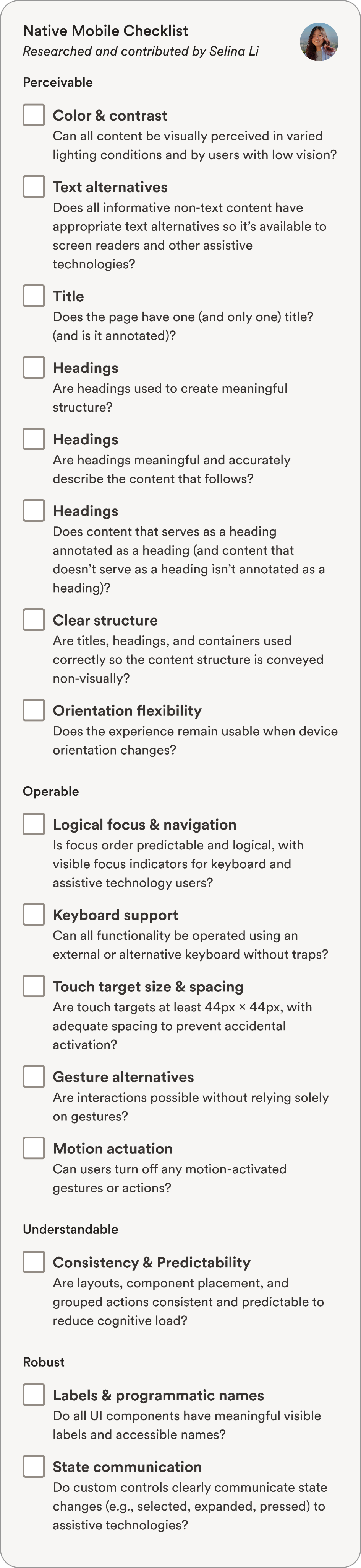
Mobile accessibility checklist:
I developed a comprehensive checklist organized around the four WCAG principles: perceivable, operable, understandable, and robust. Instead of asking designers to remember dozens of accessibility rules, the checklist turns accessibility into a standard design review process.
Mobile accessibility annotation library:
ADP’s accessibility annotation toolkit provides a shared language between designers and developers to document how accessibility is accounted for in the design. Accessibility annotations are marked up early on in the design process to ensure accessibility remains at the forefront. I expanded the toolkit with guidance specifically for native mobile interactions.
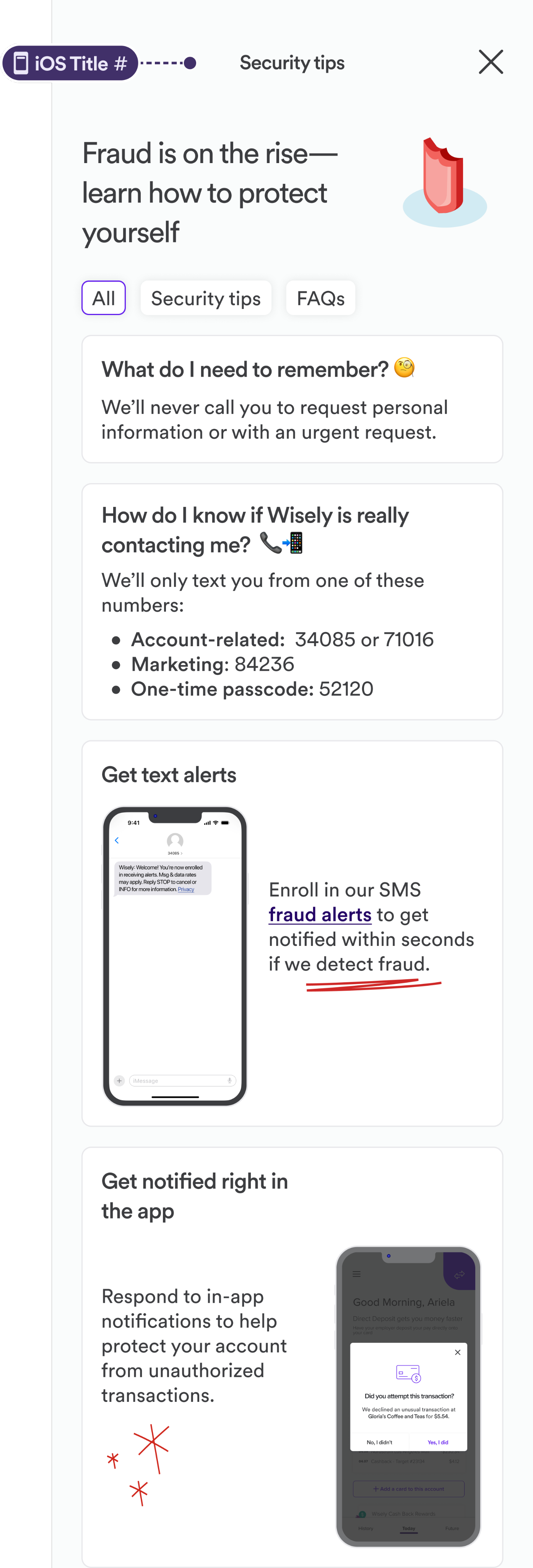
Titles
On mobile, titles are often dynamic and contextual, not static page headings like on the web. Mobile screens usually have navigation bars, system headings, or dynamic headings that may change. It’s also the primary location cue as users don’t see a location URL or breadcrumbs like on desktop.
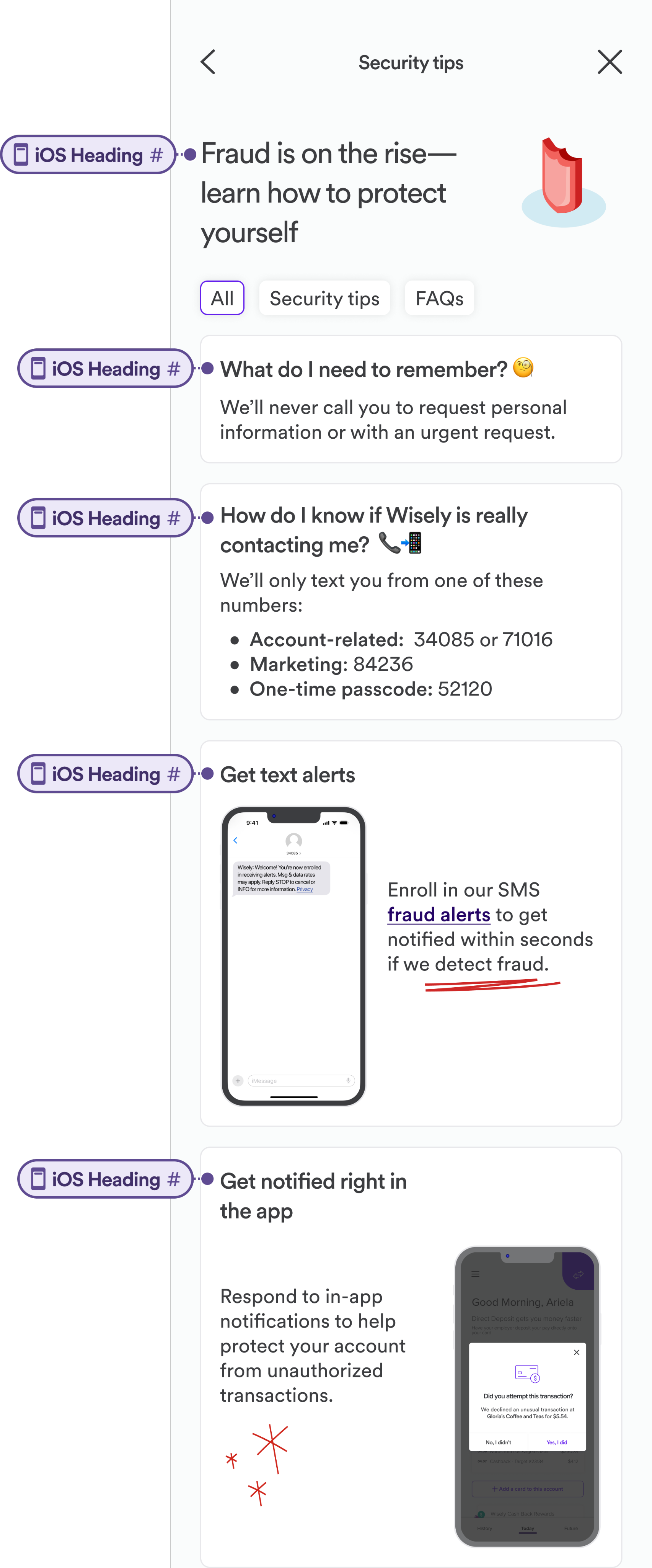
Headings
On desktop, headers have a strict hierarchy from H1 to H6,. However, on mobile, iOS does not enforce a hierarchy. Headings are treated as navigational landmarks, not structural containers.
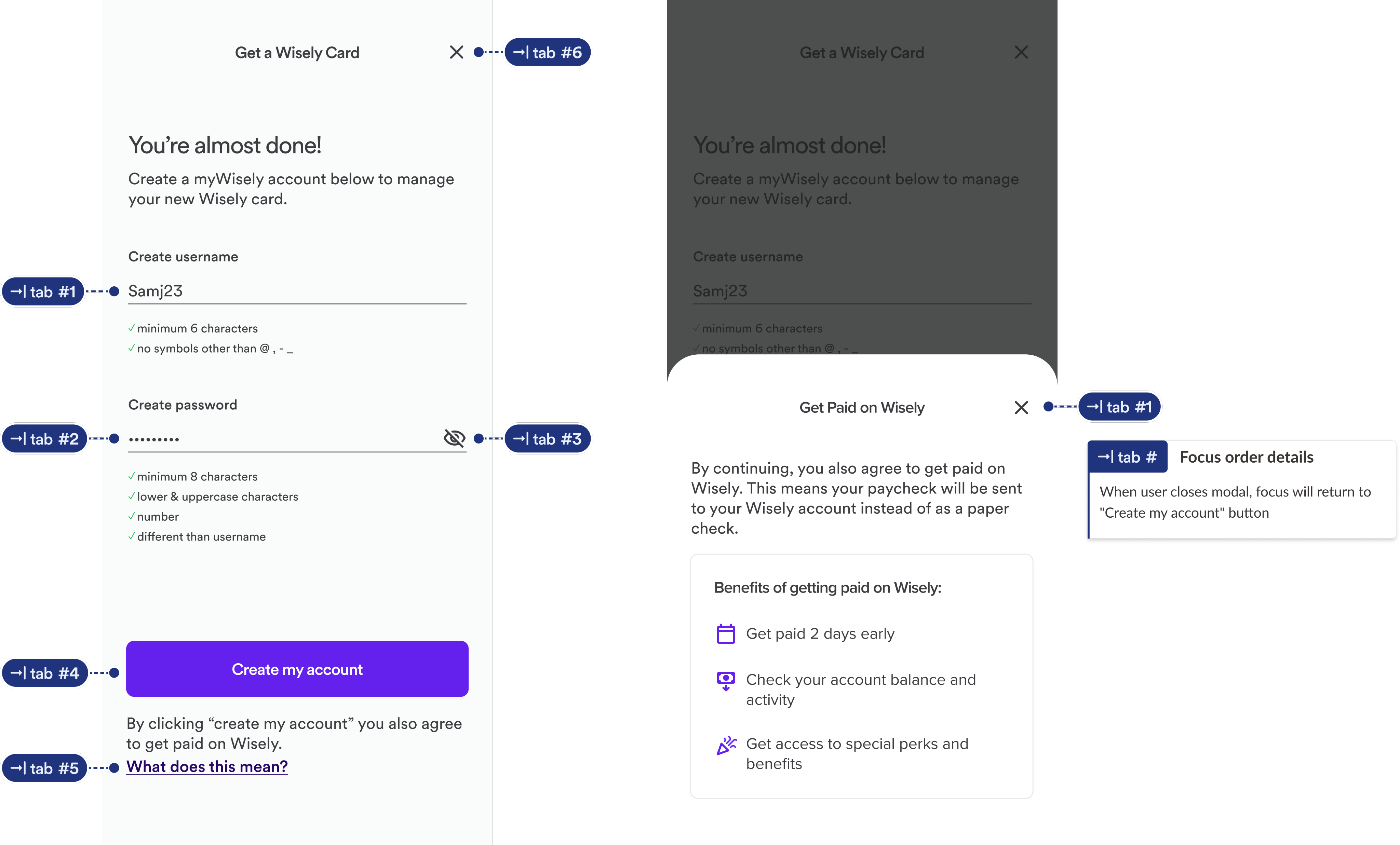
Tab/focus order
On mobile, users navigate linearly, not spatially. UI components like cards, tiles, overlays, and bottom sheets can easily break logical order. When annotating for reading order and focus order, define the order of the elements, what is skipped and what becomes active/inactive when layers appear.
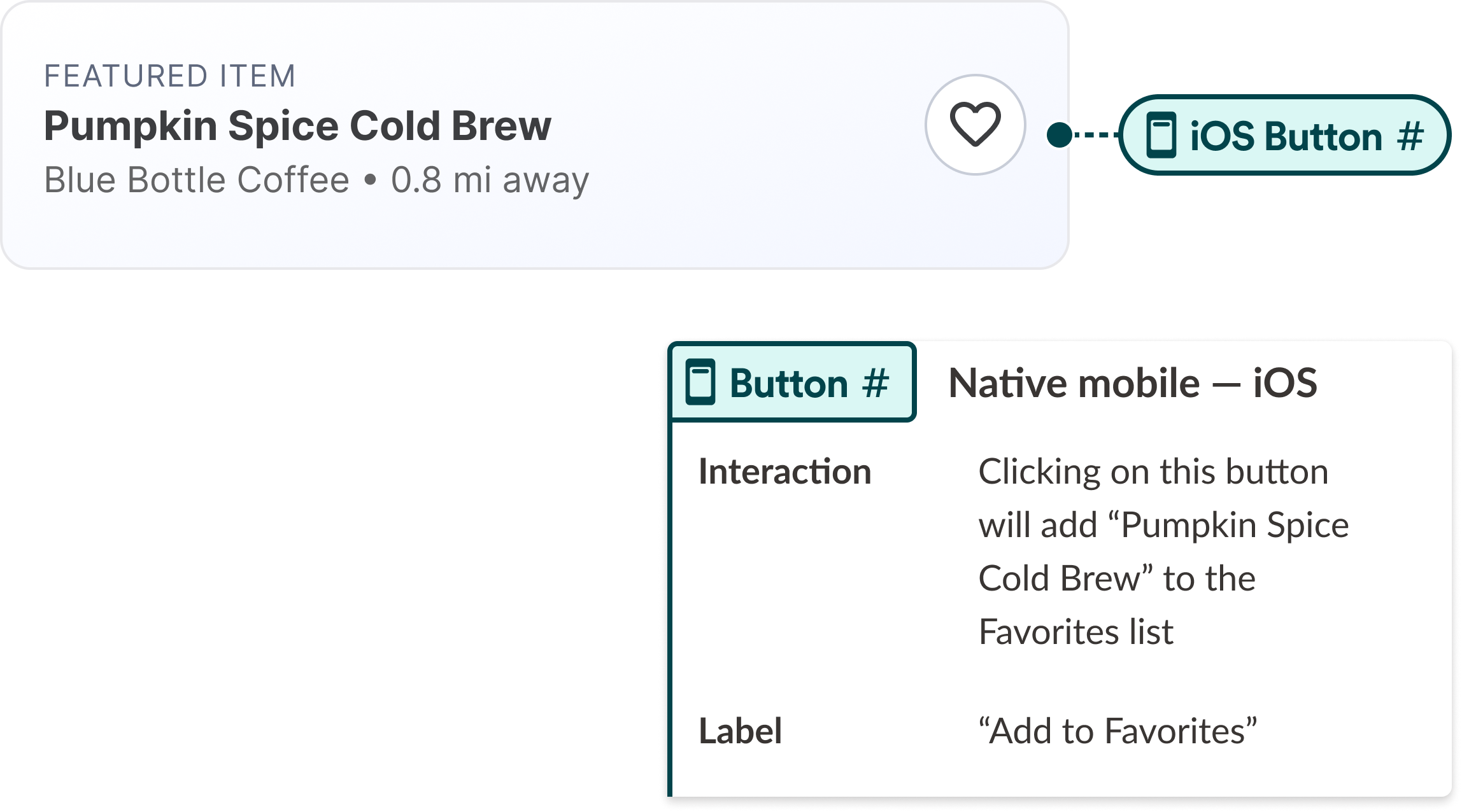
Label
On mobile, icons are commonly unlabeled visually due to space constraint. That’s why for every control, we should design for what text is visible, what text is announced, and whether they are the same.
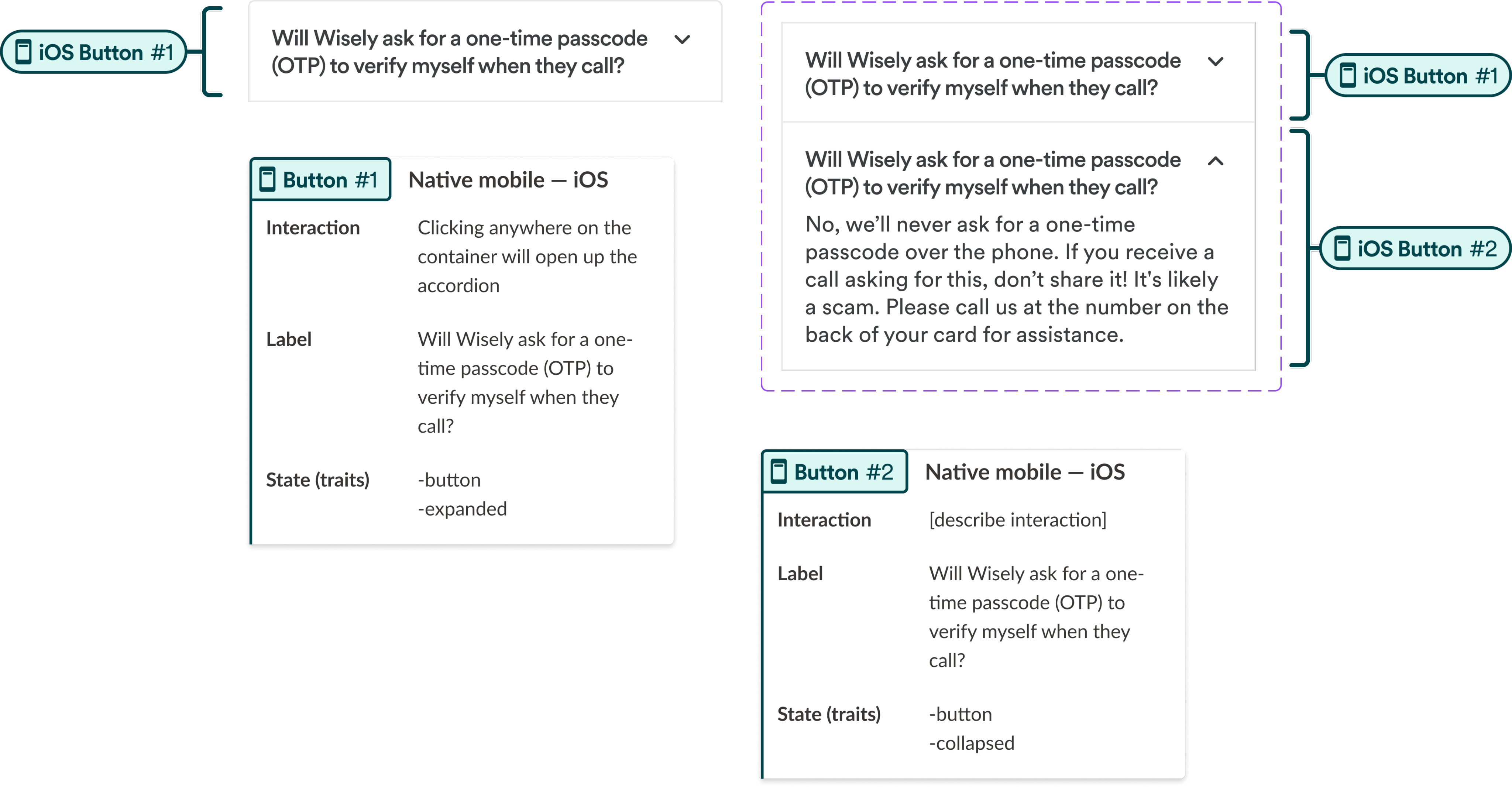
Visual state change
Visual state changes on mobile are often subtle.
Examples of state changes:
- Toggle switches
- Expand/collapse
- Selected tabs
- Loading states
When annotating for state changes, we should clarify state changes and announce these changes to the screen reader.
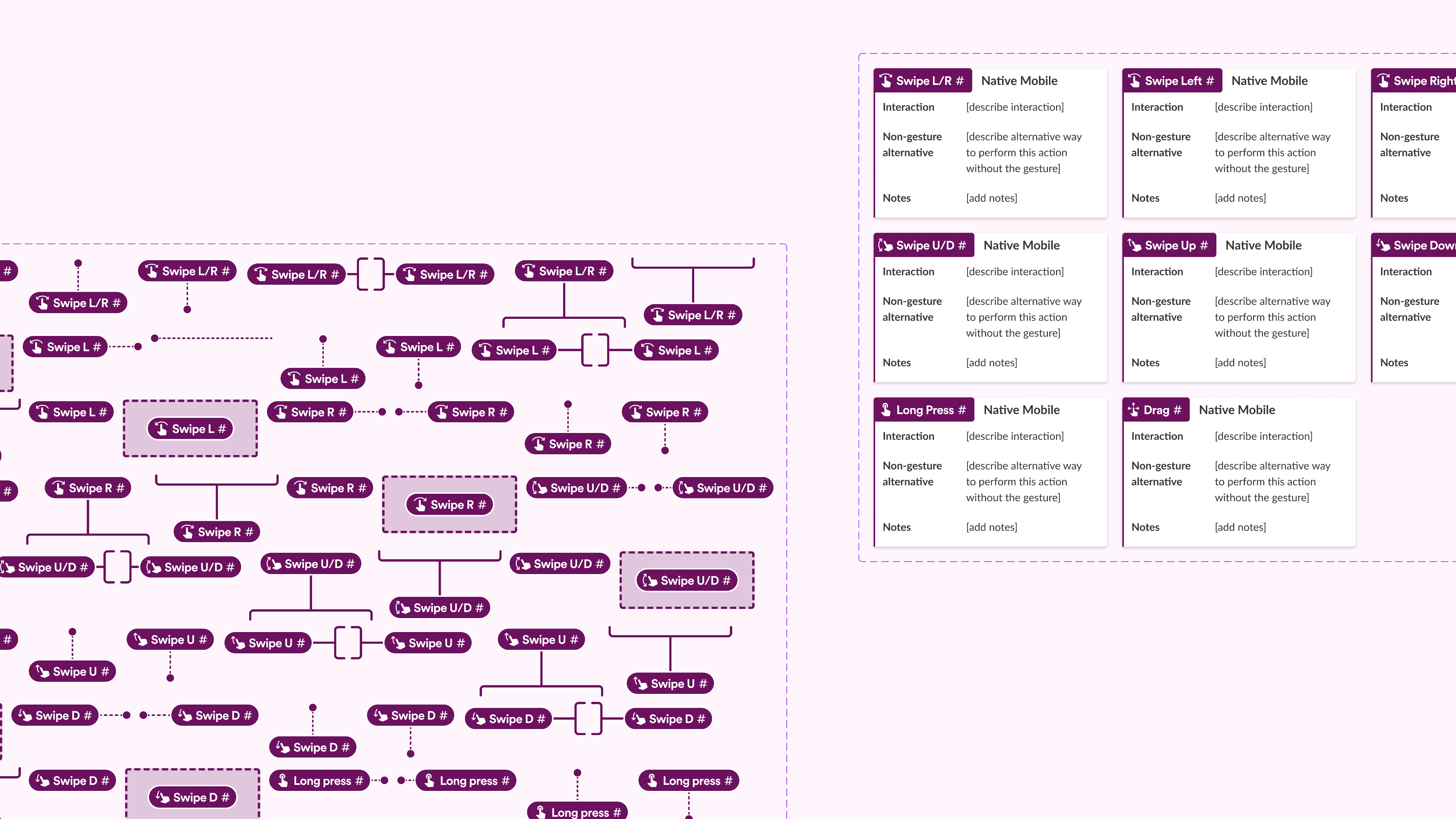
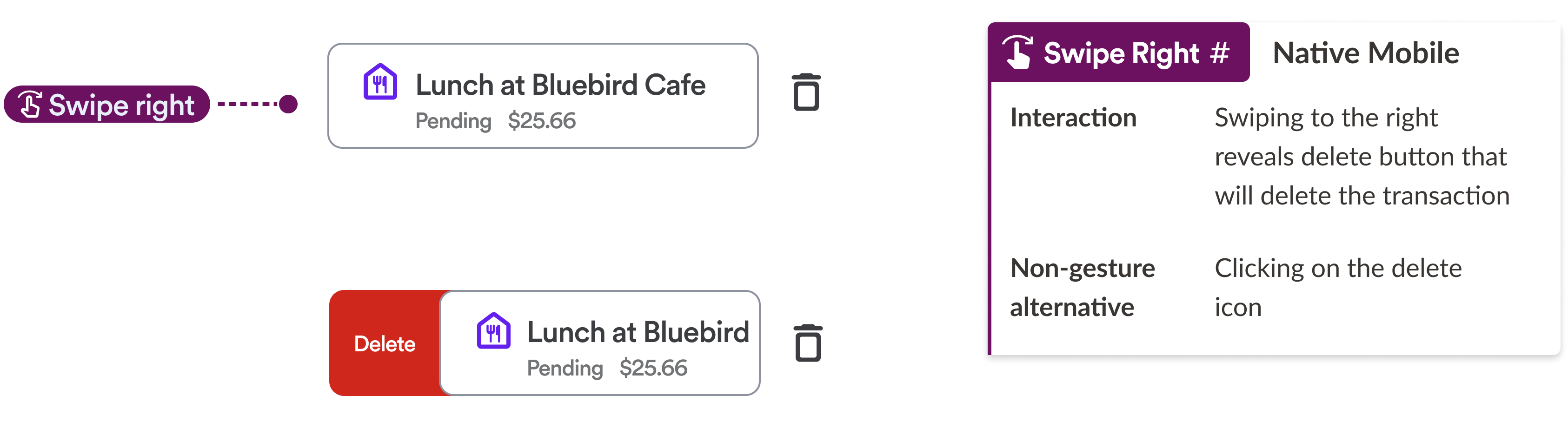
Gestures
Gestures need annotation and documentation. Mobile UI relies on gestures (swipe, long press, drag). Screen readers often replace gestures with focus + activate, but some gestures are undiscoverable without instructions. As designers, we should annotate what gestures exists, whether there’s a non-gesture alternative and provide one if there isn’t, and explain how the action is discovered.
Orientation changes
Orientation changes are common on mobile (switching from landscape to portrait mode). However, some users cannot rotate their device - for example, users with a motor disability who has their screen mounted to their wheel chair.
Driving lasting impact ✻
Although this project wasn’t measured by product metrics, it improved accessibility maturity across the design organization at ADP.
The impact this project had:
- Established mobile-specific accessibility guidance where none previously existed
- Expanded ADP’s accessibility annotation toolkit
- Created a guidebook for native mobile accessibility with reusable resources for building future mobile products
- Reduced ambiguity during developer-designer handoff
- Encouraged accessibility conversations earlier in the design process
- More importantly, gave designers practical tools to build more inclusive, accessibility mobile experiences with confidence
My presentation for the cohort showcase ✻
Takeaways ✻
Accessibility isn’t something you verify just before launch, cross your fingers, and hope for the best. It’s something you design intentionally from the very beginning.
This project gave me an opportunity to address a gap that I identified regarding the accessibility standards at ADP. And I also want to acknowledge how appreciative I am to take on this independent project; I had completed creative freedom to explore this problem space and create a solution that would contribute to the broader design community. This case study is a great example of how some of the highest-impact work I’ve done as a designer isn’t just designing on Figma and shipping another feature, but recognizing a gap and creating a system to help every designer build better products.
You made it to the end! Check out these other case studies
Scaling Accessible Native Mobile Design at ADP ✦

I created a centralized guidebook to standardize mobile accessibility practices, improve cross-functional alignment, and support more inclusive product development.
Date: September 11, 2025- May 14, 2026
Role: Product Designer, Accessibility cohort participant
Project Type: Accessibility
Tools & Method: Figma, Copilot
It started with a question ✻
How do you design accessible experiences for a platform that has almost no mobile accessibility standards?
That was the challenge I set out to solve during ADP’s eight-month Accessibility Cohort. While ADP had robust accessibility guidance for web products, I discovered a significant gap in resources for native mobile experiences. Rather than creating another reference document, I built a practical accessibility framework that designers could immediately apply to their work.
The project included:
- a mobile accessibility checklist based on WCAG principles
- mobile-specific accessibility personas
- guidance for native interaction patterns and assistive technologies
- standardized accessibility annotations for gestures, focus order, screen readers, state changes, and orientation
- recommendations for integrating accessibility throughout the mobile design process
My goal wasn’t simply to improve one product—it was to give designers the tools and confidence to create accessible mobile experiences at scale.
Mobile accessibility is treated like desktop accessibility—when they’re fundamentally different design problems.
ADP had well-established accessibility guidance for web products, but very little documentation for native mobile experiences. At first glance, this didn’t seem like a major issue. But after studying assistive technologies and evaluating our existing resources, I realized something important: Designing an accessible mobile experience isn’t simply about shrinking a desktop interface. Native mobile introduces an entirely different interaction model.
Why native mobile accessibility is different:
Touch and gesture focused interaction
Gestures replace visible actions. On desktop, many interactions are discoverable through buttons, menus, and hover states. Mobile relies heavily on gestures.
Phones are used in unpredictable settings
People rarely use mobile devices with their full attention. They interact while commuting, walking, holding groceries, etc. It’s safe to assume the user may be distracted!
Touch replaces precision
For users with limited dexterity or motor impairments, small tap targets, tightly spaced controls or interactions that require precise timing can be difficult to use.
Smaller screen size
There is less space to convey information which increases visual density. As a result, error, label text, and helper text are easier to miss.
Constant interruption and task switching
Mobile usage is fragmented and apps are frequently used in the background. Design needs to handle interruptions gracefully and support multi-tasking.
Why does this matter? ✻
Accessibility isn’t only for people with permanent disabilities.
It’s for someone navigating an app while carrying groceries.
It’s for someone checking their phone in bright sunlight.
It’s for someone using one hand while holding a child.
It’s for someone recovering from an injury.
Accessibility improves products for everyone because it accounts for the realities of how people actually use technology. This philosophy became the foundation of my project.
Designing for real people, not edge cases ✻
As designers, empathy is one of our strongest tools. Leveraging empathy, I created personas representing users with a range of permanent, temporary, and situational disabilities. The goal is to ground every design recommendation in real-world scenarios and to help designers understand who user with disabilities are and the challenges they experience navigating on mobile.
The personas:
- Jordan who is low vision and uses VoiceOver
- Trish who is deafblind and uses Braille displays
- Morgan who has cerebral palsy and relies on alternative input methods
- Jamie who has dyslexia and struggles to read
Rather than treating people with disabilities as edge cases, I reframed them as representatives of normal, everyday people who have different ways of navigating on mobile. Building these personas is important to shift people’s perspectives from designing for disabilities to designing for everyone.
Elevating accessibility across the design process ✻
After exploring existing mobile accessibility toolkits and meeting with developers to discuss annotating on mobile, I created a guidebook consisting of two resources that now support designers working on native mobile products: a mobile accessibility checklist and an expansion of the ADP’s accessibility toolkit to include native mobile interactions. Let’s go over these two resources in detail!
Mobile accessibility checklist:
I developed a comprehensive checklist organized around the four WCAG principles: perceivable, operable, understandable, and robust. Instead of asking designers to remember dozens of accessibility rules, the checklist turns accessibility into a standard design review process.
Mobile accessibility annotation library:
ADP’s accessibility annotation toolkit provides a shared language between designers and developers to document how accessibility is accounted for in the design. Accessibility annotations are marked up early on in the design process to ensure accessibility remains at the forefront. I expanded the toolkit with guidance specifically for native mobile interactions.
Titles
On mobile, titles are often dynamic and contextual, not static page headings like on the web. Mobile screens usually have navigation bars, system headings, or dynamic headings that may change. It’s also the primary location cue as users don’t see a location URL or breadcrumbs like on desktop.
Headings
On desktop, headers have a strict hierarchy from H1 to H6,. However, on mobile, iOS does not enforce a hierarchy. Headings are treated as navigational landmarks, not structural containers.
Tab/focus order
On mobile, users navigate linearly, not spatially. UI components like cards, tiles, overlays, and bottom sheets can easily break logical order. When annotating for reading order and focus order, define the order of the elements, what is skipped and what becomes active/inactive when layers appear.
Label
On mobile, icons are commonly unlabeled visually due to space constraint. That’s why for every control, we should design for what text is visible, what text is announced, and whether they are the same.
Visual state change
Visual state changes on mobile are often subtle.
Examples of state changes:
- Toggle switches
- Expand/collapse
- Selected tabs
- Loading states
When annotating for state changes, we should clarify state changes and announce these changes to the screen reader.
Gestures
Gestures need annotation and documentation. Mobile UI relies on gestures (swipe, long press, drag). Screen readers often replace gestures with focus + activate, but some gestures are undiscoverable without instructions. As designers, we should annotate what gestures exists, whether there’s a non-gesture alternative and provide one if there isn’t, and explain how the action is discovered.
Orientation changes
Orientation changes are common on mobile (switching from landscape to portrait mode). However, some users cannot rotate their device - for example, users with a motor disability who has their screen mounted to their wheel chair.
Driving lasting impact ✻
Although this project wasn’t measured by product metrics, it improved accessibility maturity across the design organization at ADP.
The impact this project had:
- Established mobile-specific accessibility guidance where none previously existed
- Expanded ADP’s accessibility annotation toolkit
- Created a guidebook for native mobile accessibility with reusable resources for building future mobile products
- Reduced ambiguity during developer-designer handoff
- Encouraged accessibility conversations earlier in the design process
- More importantly, gave designers practical tools to build more inclusive, accessibility mobile experiences with confidence
My presentation for the cohort showcase ✻
Takeaways ✻
Accessibility isn’t something you verify just before launch, cross your fingers, and hope for the best. It’s something you design intentionally from the very beginning.
This project gave me an opportunity to address a gap that I identified regarding the accessibility standards at ADP. And I also want to acknowledge how appreciative I am to take on this independent project; I had completed creative freedom to explore this problem space and create a solution that would contribute to the broader design community. This case study is a great example of how some of the highest-impact work I’ve done as a designer isn’t just designing on Figma and shipping another feature, but recognizing a gap and creating a system to help every designer build better products.
You made it to the end! Check out these other case studies
Scaling Accessible Native Mobile Design at ADP ✦
I created a centralized guidebook to standardize mobile accessibility practices, improve cross-functional alignment, and support more inclusive product development.
Date: September 11, 2025- May 14, 2026
Role: Product Designer, Accessibility cohort participant
Project Type: Accessibility
Tools & Method: Figma, Copilot
It started with a question ✻
How do you design accessible experiences for a platform that has almost no mobile accessibility standards?
That was the challenge I set out to solve during ADP’s eight-month Accessibility Cohort. While ADP had robust accessibility guidance for web products, I discovered a significant gap in resources for native mobile experiences. Rather than creating another reference document, I built a practical accessibility framework that designers could immediately apply to their work.
The project included:
- a mobile accessibility checklist based on WCAG principles
- mobile-specific accessibility personas
- guidance for native interaction patterns and assistive technologies
- standardized accessibility annotations for gestures, focus order, screen readers, state changes, and orientation
- recommendations for integrating accessibility throughout the mobile design process
My goal wasn’t simply to improve one product—it was to give designers the tools and confidence to create accessible mobile experiences at scale.
Mobile accessibility is treated like desktop accessibility—when they’re fundamentally different design problems.
ADP had well-established accessibility guidance for web products, but very little documentation for native mobile experiences. At first glance, this didn’t seem like a major issue. But after studying assistive technologies and evaluating our existing resources, I realized something important:
Designing an accessible mobile experience isn’t simply about shrinking a desktop interface. Native mobile introduces an entirely different interaction model.
Why native mobile accessibility is different:
Phones are used in unpredictable settings
People rarely use mobile devices with their full attention. They interact while commuting, walking, holding groceries, etc. It’s safe to assume the user may be distracted!
Touch and gesture focused interaction
Gestures replace visible actions. On desktop, many interactions are discoverable through buttons, menus, and hover states. Mobile relies heavily on gestures.
Touch replaces precision
For users with limited dexterity or motor impairments, small tap targets, tightly spaced controls or interactions that require precise timing can be difficult to use.
Constant interruption and task switching
Mobile usage is fragmented and apps are frequently used in the background. Design needs to handle interruptions gracefully and support multi-tasking.
Smaller screen size
There is less space to convey information which increases visual density. As a result, error, label text, and helper text are easier to miss.
Why does this matter? ✻
Accessibility isn’t only for people with permanent disabilities.
It’s for someone navigating an app while carrying groceries.
It’s for someone checking their phone in bright sunlight.
It’s for someone using one hand while holding a child.
It’s for someone recovering from an injury.
Accessibility improves products for everyone because it accounts for the realities of how people actually use technology. This philosophy became the foundation of my project.
Designing for real people, not edge cases ✻
As designers, empathy is one of our strongest tools. Leveraging empathy, I created personas representing users with a range of permanent, temporary, and situational disabilities. The goal is to ground every design recommendation in real-world scenarios and to help designers understand who user with disabilities are and the challenges they experience navigating on mobile.
The personas:
- Jordan who is low vision and uses VoiceOver
- Trish who is deafblind and uses Braille displays
- Morgan who has cerebral palsy and relies on alternative input methods
- Jamie who has dyslexia and struggles to read
Rather than treating people with disabilities as edge cases, I reframed them as representatives of normal, everyday people who have different ways of navigating on mobile. Building these personas is important to shift people’s perspectives from designing for disabilities to designing for everyone.
Elevating accessibility across the design process ✻
After exploring existing mobile accessibility toolkits and meeting with developers to discuss annotating on mobile, I created a guidebook consisting of two resources that now support designers working on native mobile products: a mobile accessibility checklist and an expansion of the ADP’s accessibility toolkit to include native mobile interactions. Let’s go over these two resources in detail!
Mobile accessibility checklist:
I developed a comprehensive checklist organized around the four WCAG principles: perceivable, operable, understandable, and robust. Instead of asking designers to remember dozens of accessibility rules, the checklist turns accessibility into a standard design review process.
Mobile accessibility annotation library:
ADP’s accessibility annotation toolkit provides a shared language between designers and developers to document how accessibility is accounted for in the design. Accessibility annotations are marked up early on in the design process to ensure accessibility remains at the forefront. I expanded the toolkit with guidance specifically for native mobile interactions.
Titles
On mobile, titles are often dynamic and contextual, not static page headings like on the web. Mobile screens usually have navigation bars, system headings, or dynamic headings that may change. It’s also the primary location cue as users don’t see a location URL or breadcrumbs like on desktop.
Headings
On desktop, headers have a strict hierarchy from H1 to H6,. However, on mobile, iOS does not enforce a hierarchy. Headings are treated as navigational landmarks, not structural containers.
Tab/focus order
On mobile, users navigate linearly, not spatially. UI components like cards, tiles, overlays, and bottom sheets can easily break logical order. When annotating for reading order and focus order, define the order of the elements, what is skipped and what becomes active/inactive when layers appear.
Label
On mobile, icons are commonly unlabeled visually due to space constraint. That’s why for every control, we should design for what text is visible, what text is announced, and whether they are the same.
Visual state change
Visual state changes on mobile are often subtle.
Examples of state changes:
- Toggle switches
- Expand/collapse
- Selected tabs
- Loading states
When annotating for state changes, we should clarify state changes and announce these changes to the screen reader.
Gestures
Gestures need annotation and documentation. Mobile UI relies on gestures (swipe, long press, drag). Screen readers often replace gestures with focus + activate, but some gestures are undiscoverable without instructions. As designers, we should annotate what gestures exists, whether there’s a non-gesture alternative and provide one if there isn’t, and explain how the action is discovered.
Orientation changes
Orientation changes are common on mobile (switching from landscape to portrait mode). However, some users cannot rotate their device - for example, users with a motor disability who has their screen mounted to their wheel chair.
Driving lasting impact ✻
Although this project wasn’t measured by product metrics, it improved accessibility maturity across the design organization at ADP.
The impact this project had:
- Established mobile-specific accessibility guidance where none previously existed
- Expanded ADP’s accessibility annotation toolkit
- Created a guidebook for native mobile accessibility with reusable resources for building future mobile products
- Reduced ambiguity during developer-designer handoff
- Encouraged accessibility conversations earlier in the design process
- More importantly, gave designers practical tools to build more inclusive, accessibility mobile experiences with confidence
My presentation for the cohort showcase ✻
Takeaways ✻
Accessibility isn’t something you verify just before launch, cross your fingers, and hope for the best. It’s something you design intentionally from the very beginning.
This project gave me an opportunity to address a gap that I identified regarding the accessibility standards at ADP. And I also want to acknowledge how appreciative I am to take on this independent project; I had completed creative freedom to explore this problem space and create a solution that would contribute to the broader design community. This case study is a great example of how some of the highest-impact work I’ve done as a designer isn’t just designing on Figma and shipping another feature, but recognizing a gap and creating a system to help every designer build better products.
You made it to the end! Check out these other case studies
Overview
User personas
Guidebook tools
Final showcase